Saturday, December 29, 2012

Art 2012: Ocean Park at OCMA

by Stephen Cummings

Richard Diebenkorn: The Ocean Park Series, photo from The Huffington Post

It's rare to come across an Ocean Park painting in the gardens of galleries dotting our country's coasts and interiors. Rarer still is it to find more than one in a single outing. Isolated, these paintings are novelties, wanderers from that great body of work by the great Richard Diebenkorn, his crowning achievement, his masterpiece(s).

We know because we've seen them in books, salivating and wondering if we'd ever have the opportunity to see them in person. Those stragglers we find now and again are confirmations of Ocean Park's existence, but alone they only intensify the curiosity. On the page the paintings are bright, their colors played up against the intense white, and their sizes obliterated, reduced to measurements of too many inches. With only the occasional representative, the question inevitably persists: what must the others be like?

This year, for anyone with the means in Southern California, Eastern Texas, or within a reasonable radius of Washington, D.C., that curiosity was finally satisfied with Richard Diebenkorn: The Ocean Park Series, "the first major museum exhibition to explore the artist’s most celebrated series", as the Orange County Museum of Art put it.

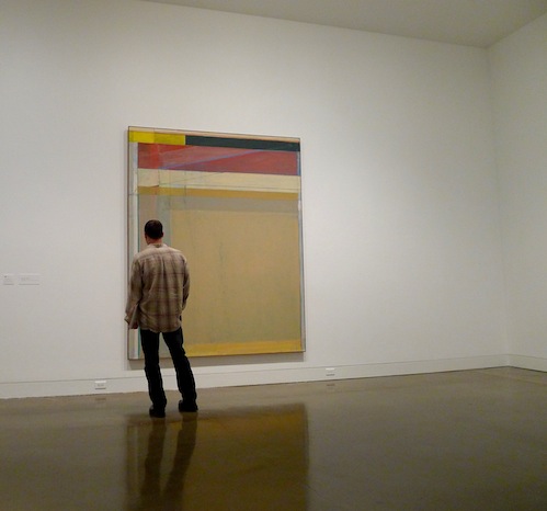
The colors of the catalogues did not accompany these paintings into real life. Diebenkorn's reality is much more subdued and contemplative. The paintings, as we know, fill walls, but less well known is that many fill mere inches. With rooms and rooms of Ocean Park, each piece was no longer a memento, but a full fledged force to behold — or by which to be held, turned, pushed. There is no monolithic Ocean Park, not in size or palette or medium. With uncommon authority, each canvass — or collage, or etching, or cigar box lid — directs you in its own way and offers its own unique rewards.

One long held measure of a painting's effectiveness has been its ability to function both up close and at a distance. The painting, it is said, should excite the eye no matter what the proximity. Surprisingly however, many of these works do no such thing, and interestingly manage to in no way fall short. While most paintings that draw you in and prove wanting only disappoint, Diebenkorn's seem simply to say to you, 'No no, go stand over there,' as though there is an optimal viewing range for every piece, and each will let you know in turn what that position is.

In this way the paintings upend the common notion of "push and pull" which generally refers to the illusion of space within a painting. At the Orange County Museum, the push and pull was of the visitor, paintings tugging you in from other rooms, pressing you into oblique viewing angles, pulling you right up to the layered surfaces, and pushing you back when you got too close.

What's more, for all the buzz around their landscape inspiration — some have mentioned overhead views of farmland in addition the Ocean Park neighborhood itself — there isn't much space in these paintings. Diebenkorn seems to keep colors flat precisely to prevent them from competing for depth. Thus, a mark that's technically over can be through, as in Ocean Park #54, in which an opaque blue line pushes its way through a same blue scumbling. The interplay here is between millimeters, not miles, for as with much of the artist's work, what each piece reveals more than anything else is the process of its own making.

The what of that process was of course Diebenkorn's constant revision. A layer of yellow over red, washes of pink and blue and green resolving finally to a beige rose, lines that intersect and intertwine and flow from here to there all to tie that end of the surface to this one. Diebenkorn could let flecks of paint fly as well as Cy Twombly and may have given more attention to edges than Piet Mondrian. Asked once whether he had ever let a particular group of paintings out of his studio, the artist replied, "These? No, no, they're not done. Or, they're sort of cooking." For Diebenkorn there was no recipe to follow; he just had to keep tasting to see if he'd gotten the balance of flavors right.

There has been no shortage of praise for this traveling one man show. The widely known but little conglomerated series stands as a capstone to what was already an impressive artistic career. The Dallas Morning News referred in its review to Diebenkorn's "Southern California sublime"; The LA Times called the show one "you might have wanted to see but that you didn't know you really had to see -- until you [saw] it," (italics added); and The Washington Post billed the exhibition as "a large, dense, rewarding show devoted to one of this country’s finest abstract painters." The greatest praise may have come from critic Mat Gleason, writing for The Huffington Post, who declared, "If you miss this one, you are just not into art." Gleason's elaboration on this statement highlights the semi-elitist assholeishness of much of the art world, but the fact remains, the exhibition was really quite good.

So while it may not be particularly impressive to top the list of someone whose obligations over the past months prevented much in the way of far reaching art viewing, I've little doubt this series would have been the jewel in the crown of any good year.

Friday, August 10, 2012

Esther Traugot

by Stephen Cummings
Esther Traugot, 2011, Egg

Jasper Johns showed us decades ago that a cast of a light bulb is something quite different from the bulb itself. Christo and Jeanne-Claude, likewise, found that wrapping objects, buildings, landscapes could transform them dramatically; the historical seat of German government repurposed into their monumental sculpture, if only for the time it was enveloped. More recently, knitters have entered the fold, Olek, probably most famously, covering the Charging Bull in New York's financial district.

The impulses are different, but the results are interestingly similar. Johns, in his usual way, chose something ubiquitous and made it into high art, a not unprecedented, but still somewhat absurd gesture. Christo and Jeanne-Claude elevated an already elevated construction, making profound again a selection from the once most highly regarded art form. And Olek turned the banker's ego pink.

Each of these artists transformed the somethings they worked with into very similar, but undeniably different somethings else, and it is as a part of this tradition that Esther Traugot has positioned herself. Crocheting sheaths of golden fiber, the artist encases fragments from the natural world, simplifying them into irregular pieces of sculpture. The smoothing out is common to each of the artists mentioned, making the objects on display more digestible by their presentation, and by being simpler, somehow more worthwhile. Such is the case with Traugot's Rootsy, part of her Outside In show recently on display at Chandra Cerrito Contemporary in Oakland. The wrapped object is both adorned and erased by its casing; writhing bits of tree mounted for consideration, swallowed by the pollen-yellow, interlocking threads.

Thus, by loop upon meticulous fiber loop, does this artist "gild" her subjects, making precious the insistently banal. In contrast to Olek's blunt emasculation, Traugot raises her subjects' profiles by the tediousness of her action. At once cradled and adorned, these objects are treated with reverence, whether attention is drawn to the surface or its shape. Yarn blankets the inside of Home Again 2, standing in for the creature that once inhabited this shell, protruding like an odd, careful growth. In Egg an exterior portion of the object is ornately framed by its intricate cover, as though inviting us to take a look at the lovely texture.

But then again, it's an egg in a sweater.

Whatever the profundity of Traugot's sculptures, they're also weird. The tediousness of the adornment is in a way as banal as the objects themselves. When a piece of a twig or shell protrudes from its wrapper it's unclear what the difference is. The parts behind the yellow screen are notionally preserved, but as fragile as ever. Why take so much care with this part and not that? The answer may be that no part is more important than another. In the past, Traugot's cast-off bits of wrapped up nature have been installation, artifact, and plays on the tradition of landscape in art, but in all cases the pattern of yellow curls invites a look at each object that would not otherwise have happened. Traugot, like her predecessors, forces a look at things we've all seen a thousand times, only to have us see something else.

See more work by Esther Traugot on the GO SEE ART Flickr page.

Friday, March 2, 2012

Jenny Saville Now

by Stephen Cummings

Jenny Saville, Isis, 2011

What do you say about Jenny Saville? One of the Young British Artists who found fame in the early nineties, Saville remains perhaps best known for that first body of work she produced to fill London's Saatchi Gallery in 1994. Those paintings were brazen at the time, large and naked and very much anti-ideal. Saville confronted her audience without being combative. Her feminism proffered vulnerability. Arranging the naked form became her routine, and the nakedness, along with the British connection, led maybe inevitably to comparisons with Lucian Freud, a painter whose surfaces are as unpolished as his subjects, and comparison to whom is not a small compliment.

But that was 1994.

Two decades since those earliest works were snatched up, Jenny Saville at Florida's Norton Museum of Art puts old and new side by side, demonstrating both stark change and general continuity in the artist's work. The shock of the monumental, unlovely nude has certainly dulled with the passage of time, as has Saville's flirtation with bloody things. Women have remained her focus, though not so much the image of women. But without the confrontation of Saville's early subjects, what we're left with are just these paintings and drawings. And emphasis, unfortunately, must be placed on just.

Absent a powerful political message, Jenny Saville must be considered as a painter. That the artist is skilled there can still be no doubt. Her series Reproduction drawings, for example, demonstrates highly competent draftsmanship; strong linear development, replete with varied weights and cross-contours and utmost confidence — all the things we try to teach students in drawing class. Her paint application is equally facile, but how many MICA graduates paint just as well?

Comparisons to Freud are all well and good when we're considering the strange baseness of pale, human flesh, but what more does Saville have in common with the recently departed master? Looming large and bursting at the canvasses' edges, her figures are much too grandiose to share his concerns. And while Saville moved on to splashier, more demonstrative paint application, Freud's was a long obsession with coarse, awkward plainness. To her credit, Saville herself draws a contrast: "Freud's women are dead bodies; they lie there," she says. "I don't make those images." And as the Norton points out, "Critic Charles Darwent wrote about [Saville's Fulcrum] '[...] The echo is less of Freud than of Francis Bacon, humanity on the butcher's block.'" But is comparison to Bacon fair? Here again is the British connection, but the pain of a Bacon painting is abject. Even his paint is tortured, barely holding on. Saville's, by contrast, is smooth and easy. She likes that way paint flows.

More descriptive in the early years, the brushstrokes in much of this exhibition document Saville's tendency toward broader, more blatant mark-making. "I have moved away from the anatomy of the body to the anatomy of paint," she said. With a statement like that you might expect to see a painter like Willem de Kooning, whose figures were almost obliterated by "the anatomy of paint". But Saville's paint, rather than redefining her figures, remians wholly beholden to description. However free her brushstrokes almost are, they still subordinate themselves to her very reserved mosaic — and not a Chuck Close-like mosaic either. Heads so large as Saville's compare naturally to Close, but are not nearly straightforward enough to be so powerfully honest. Their roving gestures come across as forced, if not as forced as the containment of would-be wild brushstrokes within unsurprising portraits.

The most recent piece in Jenny Saville is Isis (2011), an over life-size portrait of a pregnant mother, and an exemplar of the artist's progress from her initial pluck into stardom. Gone is any hint of confrontation in this subject. The woman is placid, content, and, frankly, attractive. She is a contemporary embodiment of the Ancient Egyptian goddess of motherhood — or so it is indicated. Saville's description is lovely, but the content, including "ancient texts" projected across this woman's body, is entirely tacked on. Those splashy, overemphasized strokes of color have fortunately gone away, reverting to the simpler, softer approach. What we're looking at in the end is a portrait, plain and simple, forced lighting situation or no. There is not a hint of Freud, nor Bacon. Instead, the artist Jenny Saville resembles most closely with this canvas, more than any other I can think of, is John Singer Sargent, whom de Kooning called "a good, bad painter".