Friday, March 8, 2013

Michael Heizer's Levitated Mass

by Stephen Cummings

Michael Heizer, 2012, Levitated Mass

It seemed the great majority of opinions formed around Michael Heizer's instantly famous sculpture, installed last year at the Los Angeles County Museum of Art, had been decided well in advance of it's actual creation. In the extreme cases, it was either the greatest thing to happen in four thousand years, or the worst possible thing anyone could ever do with a boulder. Mostly though it was just a novelty of engineering, of the effort involved in moving an object so heavy through a cityscape so sprawling — and how expensive that was. Christopher Knight, writing for the LA Times, produced an interesting analysis of the phenomenon, and was, as far as I have found, the only person to note in print that all of the judgements, whatever else they were, were coming in a little bit prematurely. "I can't tell you how many people have asked whether I like a sculpture that doesn't yet exist," he wrote last March, three months before the piece was finally unveiled.

For those who did reserve their judgements for a finished product, the reaction was middling. Many, as is usual, preferred to make no judgement, and again report on the process of bringing the piece to fruition, or the ceremony of the opening, but for those who chose to write about the earthwork itself, Knight once again provides an appropriately representative sample: "Huge advance publicity set up a love-it-or-hate-it anticipation for either a masterpiece or a fiasco. But this work is neither." Having now seen the work myself, I am inclined to agree, but the question then is why.

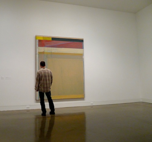
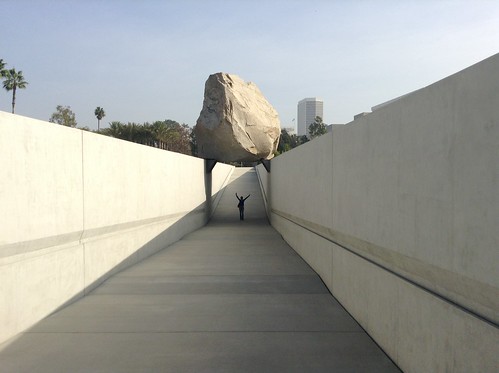
First it should be reiterated that the boulder itself is not the artwork. In other words, don't just go glance at the rock and proclaim dissatisfaction — or, for that matter, not go and still proclaim dissatisfaction. Rather, this piece seems to be about the experience of approaching and walking under the boulder through the concrete trench — just about being everywhere called a "slot" — that forms the lower portion of this large earthwork sculpture, along with the hardware holding the rock in place, namely a pair of heavy steel shelves bolted to the trench walls and the boulder. The surrounding field of decomposed granite serves mostly as a framing device, directing the focus to what is inside the trench, not out.

Much criticism has sprung from the title of the piece, Levitated Mass, which, if for some reason you're inclined to take the title of an artwork literally, promises that the famously massive boulder will float in midair, or at least present the illusion of floating. And then there was LACMA Director Michael Govan promising repeatedly ahead of time that the title was indeed to be taken literally. "The piece is actually called Levitated Mass, because, as you walk down the ramp, it will appear that the rock is levitating," he states in a YouTube video released by the museum before the rock moved from its quarry. Govan has not been one to hold back, either in his advance proclamations or subsequent praise for the piece, so it may not be surprising that it doesn't quite live up to his promises. My favorite analysis on this point comes from a deadpan Wikipedia contributor, taking a little bit more liberty than Wikipedians are generally afforded, writing, "Initial plans for the work described the boulder as being affixed to the trench walls themselves, giving the boulder the appearance of 'floating' when viewed from within the trench via optical illusion, hence the work's title. With the addition of the support shelves, this illusion does not occur." Another way of looking at it could be that the boulder does not appear to levitate any more than the ceiling in your home does when you walk down the stairs, but the writer is on to something in citing the shelves.

Ignoring the the title of Levitated Mass, we should evaluate the piece, as we would any other, based upon the reality it proposes. And what seems to be proposed, standing under the two story boulder, is that a feeling of uneasiness should set in. No, we shouldn't suspend our disbelief to think the rock is levitating, but its purchase should feel uncertain, sort of the way Richard Serra's best sculptures bend the space around themselves, disorienting viewers and seeming on the point of toppling. As it stands now, Wikipedia is on the mark. The great steel brackets lend too much stability, relegating the megalith oddly to the status of a giant knick knack, placed carefully on the mantle.

Curiously, only architectural publications have seen fit to delve into the compromises made in constructing this piece. Architectural Record notes, "The design and engineering team had to balance Heizer’s vision with the safety of the public," and goes on to describe some of the earthquake safety measures implemented in the construction. And in The Architect's Newspaper, a more exhaustive list:

Many of the design details of Levitated Mass prioritized technical requirements above aesthetics. The cement trench rises above the decomposed granite of the surrounding grounds to waist height—otherwise the building code would have required a glass railing. ADA-mandated handrails make an unavoidable contribution to the interior of the trench. And two of the concrete trench’s more noticeable characteristics have more to do with nuisance abatement than artistic panache: the skimcoat cover on the concrete will make graffiti easy to wash away and recoat, and triangle notches on both ends of the trench are meant to keep skateboarders off the concrete.

All of these elements have an effect on the experience of the piece, and one wonders if these compromises could have been mitigated? Why, for example, didn't the ADA mandated handrails simply continue to the top of the trench? They would then have appeared more as a conscious design element than regulatory accommodation. And indeed, why aren't the trench walls closer together so as to support the boulder directly? One imagines that the bolts holding the rock in place could have been disguised somehow.

As with any artwork, such speculation is just a critical exercise, since the piece is already made and not going anywhere — this one more than most. I wouldn't go quite so far as Christopher Knight in calling this piece "good". The word that comes to my mind instead is 'fine'. It's just a shame that in a piece designed to dominate a landscape for hundreds, or, it's been suggested, thousands of years, the compromise stands out just a little bit more than the vision.

Saturday, December 29, 2012

Art 2012: Ocean Park at OCMA

by Stephen Cummings

Richard Diebenkorn: The Ocean Park Series, photo from The Huffington Post

It's rare to come across an Ocean Park painting in the gardens of galleries dotting our country's coasts and interiors. Rarer still is it to find more than one in a single outing. Isolated, these paintings are novelties, wanderers from that great body of work by the great Richard Diebenkorn, his crowning achievement, his masterpiece(s).

We know because we've seen them in books, salivating and wondering if we'd ever have the opportunity to see them in person. Those stragglers we find now and again are confirmations of Ocean Park's existence, but alone they only intensify the curiosity. On the page the paintings are bright, their colors played up against the intense white, and their sizes obliterated, reduced to measurements of too many inches. With only the occasional representative, the question inevitably persists: what must the others be like?

This year, for anyone with the means in Southern California, Eastern Texas, or within a reasonable radius of Washington, D.C., that curiosity was finally satisfied with Richard Diebenkorn: The Ocean Park Series, "the first major museum exhibition to explore the artist’s most celebrated series", as the Orange County Museum of Art put it.

The colors of the catalogues did not accompany these paintings into real life. Diebenkorn's reality is much more subdued and contemplative. The paintings, as we know, fill walls, but less well known is that many fill mere inches. With rooms and rooms of Ocean Park, each piece was no longer a memento, but a full fledged force to behold — or by which to be held, turned, pushed. There is no monolithic Ocean Park, not in size or palette or medium. With uncommon authority, each canvass — or collage, or etching, or cigar box lid — directs you in its own way and offers its own unique rewards.

One long held measure of a painting's effectiveness has been its ability to function both up close and at a distance. The painting, it is said, should excite the eye no matter what the proximity. Surprisingly however, many of these works do no such thing, and interestingly manage to in no way fall short. While most paintings that draw you in and prove wanting only disappoint, Diebenkorn's seem simply to say to you, 'No no, go stand over there,' as though there is an optimal viewing range for every piece, and each will let you know in turn what that position is.

In this way the paintings upend the common notion of "push and pull" which generally refers to the illusion of space within a painting. At the Orange County Museum, the push and pull was of the visitor, paintings tugging you in from other rooms, pressing you into oblique viewing angles, pulling you right up to the layered surfaces, and pushing you back when you got too close.

What's more, for all the buzz around their landscape inspiration — some have mentioned overhead views of farmland in addition the Ocean Park neighborhood itself — there isn't much space in these paintings. Diebenkorn seems to keep colors flat precisely to prevent them from competing for depth. Thus, a mark that's technically over can be through, as in Ocean Park #54, in which an opaque blue line pushes its way through a same blue scumbling. The interplay here is between millimeters, not miles, for as with much of the artist's work, what each piece reveals more than anything else is the process of its own making.

The what of that process was of course Diebenkorn's constant revision. A layer of yellow over red, washes of pink and blue and green resolving finally to a beige rose, lines that intersect and intertwine and flow from here to there all to tie that end of the surface to this one. Diebenkorn could let flecks of paint fly as well as Cy Twombly and may have given more attention to edges than Piet Mondrian. Asked once whether he had ever let a particular group of paintings out of his studio, the artist replied, "These? No, no, they're not done. Or, they're sort of cooking." For Diebenkorn there was no recipe to follow; he just had to keep tasting to see if he'd gotten the balance of flavors right.

There has been no shortage of praise for this traveling one man show. The widely known but little conglomerated series stands as a capstone to what was already an impressive artistic career. The Dallas Morning News referred in its review to Diebenkorn's "Southern California sublime"; The LA Times called the show one "you might have wanted to see but that you didn't know you really had to see -- until you [saw] it," (italics added); and The Washington Post billed the exhibition as "a large, dense, rewarding show devoted to one of this country’s finest abstract painters." The greatest praise may have come from critic Mat Gleason, writing for The Huffington Post, who declared, "If you miss this one, you are just not into art." Gleason's elaboration on this statement highlights the semi-elitist assholeishness of much of the art world, but the fact remains, the exhibition was really quite good.

So while it may not be particularly impressive to top the list of someone whose obligations over the past months prevented much in the way of far reaching art viewing, I've little doubt this series would have been the jewel in the crown of any good year.

Friday, August 10, 2012

Esther Traugot

by Stephen Cummings
Esther Traugot, 2011, Egg

Jasper Johns showed us decades ago that a cast of a light bulb is something quite different from the bulb itself. Christo and Jeanne-Claude, likewise, found that wrapping objects, buildings, landscapes could transform them dramatically; the historical seat of German government repurposed into their monumental sculpture, if only for the time it was enveloped. More recently, knitters have entered the fold, Olek, probably most famously, covering the Charging Bull in New York's financial district.

The impulses are different, but the results are interestingly similar. Johns, in his usual way, chose something ubiquitous and made it into high art, a not unprecedented, but still somewhat absurd gesture. Christo and Jeanne-Claude elevated an already elevated construction, making profound again a selection from the once most highly regarded art form. And Olek turned the banker's ego pink.

Each of these artists transformed the somethings they worked with into very similar, but undeniably different somethings else, and it is as a part of this tradition that Esther Traugot has positioned herself. Crocheting sheaths of golden fiber, the artist encases fragments from the natural world, simplifying them into irregular pieces of sculpture. The smoothing out is common to each of the artists mentioned, making the objects on display more digestible by their presentation, and by being simpler, somehow more worthwhile. Such is the case with Traugot's Rootsy, part of her Outside In show recently on display at Chandra Cerrito Contemporary in Oakland. The wrapped object is both adorned and erased by its casing; writhing bits of tree mounted for consideration, swallowed by the pollen-yellow, interlocking threads.

Thus, by loop upon meticulous fiber loop, does this artist "gild" her subjects, making precious the insistently banal. In contrast to Olek's blunt emasculation, Traugot raises her subjects' profiles by the tediousness of her action. At once cradled and adorned, these objects are treated with reverence, whether attention is drawn to the surface or its shape. Yarn blankets the inside of Home Again 2, standing in for the creature that once inhabited this shell, protruding like an odd, careful growth. In Egg an exterior portion of the object is ornately framed by its intricate cover, as though inviting us to take a look at the lovely texture.

But then again, it's an egg in a sweater.

Whatever the profundity of Traugot's sculptures, they're also weird. The tediousness of the adornment is in a way as banal as the objects themselves. When a piece of a twig or shell protrudes from its wrapper it's unclear what the difference is. The parts behind the yellow screen are notionally preserved, but as fragile as ever. Why take so much care with this part and not that? The answer may be that no part is more important than another. In the past, Traugot's cast-off bits of wrapped up nature have been installation, artifact, and plays on the tradition of landscape in art, but in all cases the pattern of yellow curls invites a look at each object that would not otherwise have happened. Traugot, like her predecessors, forces a look at things we've all seen a thousand times, only to have us see something else.

See more work by Esther Traugot on the GO SEE ART Flickr page.

Friday, March 2, 2012

Jenny Saville Now

by Stephen Cummings

Jenny Saville, Isis, 2011

What do you say about Jenny Saville? One of the Young British Artists who found fame in the early nineties, Saville remains perhaps best known for that first body of work she produced to fill London's Saatchi Gallery in 1994. Those paintings were brazen at the time, large and naked and very much anti-ideal. Saville confronted her audience without being combative. Her feminism proffered vulnerability. Arranging the naked form became her routine, and the nakedness, along with the British connection, led maybe inevitably to comparisons with Lucian Freud, a painter whose surfaces are as unpolished as his subjects, and comparison to whom is not a small compliment.

But that was 1994.

Two decades since those earliest works were snatched up, Jenny Saville at Florida's Norton Museum of Art puts old and new side by side, demonstrating both stark change and general continuity in the artist's work. The shock of the monumental, unlovely nude has certainly dulled with the passage of time, as has Saville's flirtation with bloody things. Women have remained her focus, though not so much the image of women. But without the confrontation of Saville's early subjects, what we're left with are just these paintings and drawings. And emphasis, unfortunately, must be placed on just.

Absent a powerful political message, Jenny Saville must be considered as a painter. That the artist is skilled there can still be no doubt. Her series Reproduction drawings, for example, demonstrates highly competent draftsmanship; strong linear development, replete with varied weights and cross-contours and utmost confidence — all the things we try to teach students in drawing class. Her paint application is equally facile, but how many MICA graduates paint just as well?

Comparisons to Freud are all well and good when we're considering the strange baseness of pale, human flesh, but what more does Saville have in common with the recently departed master? Looming large and bursting at the canvasses' edges, her figures are much too grandiose to share his concerns. And while Saville moved on to splashier, more demonstrative paint application, Freud's was a long obsession with coarse, awkward plainness. To her credit, Saville herself draws a contrast: "Freud's women are dead bodies; they lie there," she says. "I don't make those images." And as the Norton points out, "Critic Charles Darwent wrote about [Saville's Fulcrum] '[...] The echo is less of Freud than of Francis Bacon, humanity on the butcher's block.'" But is comparison to Bacon fair? Here again is the British connection, but the pain of a Bacon painting is abject. Even his paint is tortured, barely holding on. Saville's, by contrast, is smooth and easy. She likes that way paint flows.

More descriptive in the early years, the brushstrokes in much of this exhibition document Saville's tendency toward broader, more blatant mark-making. "I have moved away from the anatomy of the body to the anatomy of paint," she said. With a statement like that you might expect to see a painter like Willem de Kooning, whose figures were almost obliterated by "the anatomy of paint". But Saville's paint, rather than redefining her figures, remians wholly beholden to description. However free her brushstrokes almost are, they still subordinate themselves to her very reserved mosaic — and not a Chuck Close-like mosaic either. Heads so large as Saville's compare naturally to Close, but are not nearly straightforward enough to be so powerfully honest. Their roving gestures come across as forced, if not as forced as the containment of would-be wild brushstrokes within unsurprising portraits.

The most recent piece in Jenny Saville is Isis (2011), an over life-size portrait of a pregnant mother, and an exemplar of the artist's progress from her initial pluck into stardom. Gone is any hint of confrontation in this subject. The woman is placid, content, and, frankly, attractive. She is a contemporary embodiment of the Ancient Egyptian goddess of motherhood — or so it is indicated. Saville's description is lovely, but the content, including "ancient texts" projected across this woman's body, is entirely tacked on. Those splashy, overemphasized strokes of color have fortunately gone away, reverting to the simpler, softer approach. What we're looking at in the end is a portrait, plain and simple, forced lighting situation or no. There is not a hint of Freud, nor Bacon. Instead, the artist Jenny Saville resembles most closely with this canvas, more than any other I can think of, is John Singer Sargent, whom de Kooning called "a good, bad painter".

Saturday, December 31, 2011

Art 2011: The Best of Further Wanderings

by Stephen Cummings

In a year that felt abundant with looks back at great artists my biggest regret in terms of seeing art is not having made it to New York for MoMA’s first ever retrospective of Willem de Kooning. Of course no one can be everywhere, and while I was fortunate enough to be in a lot of places this year, the trouble with being all over is that you’re bound to miss a lot from any one place in particular. So again I offer a selection of the best new works and exhibitions I managed to see over the past year. My route was at times directed by art, and at others by the whims of my life, but having bounced up and down both coasts and through several cities in between, I hope the list presented here can provide some kind of useful sample of the best the country had to offer in 2011.

A Small Self-Portrait

The year got off to a strong start with three exceptional pieces on display simultaneously at UCLA’s Armand Hammer Museum. Roberto Cuoghi's untitled self-portrait is a rare achievement in the practice of drawing. Far from feeling academic, this small piece is a staggering turn of realism with a figure as viscerally present as any painted by Manet or even Rembrandt. Coughi's portrait is unpretentious and uncanny, and reinforces realism's place in contemporary discourse — though given the rest of the portraits in this body of work, Cuoghi certainly doesn't subscribe to the school of though that prizes it above all else.

The Cutters

In adjacent galleries could be found the Hammer's All Of This And Nothing, featuring, among other works, Gedi Sibony’s The Cutters. The language of this piece was so concise, and its feeling of completion so thorough, it was clear from the beginning this would likely be one of the best things I’d see. Sibony is truly one to traffic in arrangements. As reported in W magazine a few years back, “He avoids altering his finds from their original state [...]. Before an opening he’ll spend days arranging his works so that the light will energize them, creating rich ‘situations’ for viewers.” The richness of The Cutters was, as mentioned, a quiet and powerful thing to behold.

Anticultural Positions

Also part of All Of This And Nothing was Paul Sietsema’s Anticultural Positions, a thirty-minute, looped film featuring black and white stills of the artist’s working surfaces interspersed with text from a lecture he reportedly presented in 2008. The effect was disjointed and abstract, a gorgeous visual experience complimented by the mesmerizing rattle of the projector. Literally readable in parts, but overall quite bewildering, Anticultural Positions nevertheless created an atmosphere to be savored.

The End

In Pittsburgh, another video piece proved even more enthralling. Ragnar Kjartansson’s The End, on view at the Carnegie Museum, enveloped its audience in a visual and and auditory landscape like nothing I’ve ever encountered. The weird, warped music and vast, white wilderness combined to create an environment both serene and exhilarating, and Kjartansson’s odd mix of exuberance and flippancy make him a joy to watch.

Picasso: Masterpieces from the Musée National Picasso, Paris

Another collection of greatly varied styles came from an in-depth look at a single artist in the de Young Museum’s Picasso. It was the same traveling show that left Seattle earlier in the year, drawn from the currently renovating Musée National Picasso in Paris. Now, I’ve visited that museum, but something about the way this show was laid out made the work absolutely thrilling. While it felt a little thin in the early years — a number of Picasso’s best early works having been snagged by the Steins, interestingly — man, did Picasso take off as he got older. Still lifes, portraits, busts, bathers, and even some lesser known landscapes from the artist’s early days to his last made Picasso an unforgettable look at the master.

B. Wurtz: Works, 1970 - 2011

And maybe equally unforgettable was Metro Pictures Gallery’s retrospective of B. Wurtz. Little known outside the confines of artistic circles, Wurtz has been steadily producing smart, playful sculptures since the 1970s. Some of these are freestanding, some hang on the wall, but all incorporate surprisingly common objects to produce compositions of uncommon originality and wit. So light are Wurtz’s creations that they made even Richard Tuttle’s work, concurrent at the nearby Pace Gallery, feel leaden. Reviewing the show in June, Roberta Smith was quite right in her sentiment that, “Mr. Wurtz’s show may be, in its own quiet and eccentric way, one of the high points of the summer, if not the entire year.”

Sunday, December 25, 2011

Bryson Gill: Plaisir l'Oeil

by Stephen Cummings

Bryson Gill, 2011, AAAA (Consecutive Utterance 2)

The trompe l’oeil tradition goes back a long way in the history of painting; a Baroque term, so Wikipedia reminds me, used to describe the devices of perspectival painting intended to ‘deceive the eye’ into perceiving great depth where, on a flat surface, obviously none could exist. (Ceilings opening onto the heavens were popular.) Artists working on architecture today are similarly deceptive — Banksy, perhaps most comically — but trompe l’oeil painting refers most often to that class of still life works whose represented objects are depicted in a relatively shallow space, one so carefully rendered as to fool the viewer into believing he sees not a representation, but the objects themselves. The most apt illustration of this tradition dates back to ancient Greece, where, as Pliny tells us, the painters Zeuxis and Parrhasius struck a bet to see whose painting could most closely mimic the real world. Zeuxis’s grapes were real enough to entice birds to swoop down at the supposed fruit, but when he asked Parrhasius to pull aside the cloth covering his painting, the painter realized he had been beaten, for the ‘cloth’ was the painting itself, and while Zeuxis had fooled the birds, Parrhasius had fooled Zeuxis.

Following the Renaissance, trompe l’oeil still life painting proceeded with variable popularity from the sixteenth century through the nineteenth, but the practice was largely eclipsed by the rise of Modernism, sputtering out with provincial Americans producing staid collections of playing cards and other clutter depicted against wooden backdrops. Given the accelerating pace of the twentieth century, it’s no wonder a tradition predicated on artists’ mastery of illusion was shunted aside when our collective focus shifted to ideas, and materials, and a general questioning of tradition itself — not to mention painting’s shift, from illusion to literal flatness.

So imagine my delight upon entering San Francisco’s Triple Base Gallery to find the paintings of Bryson Gill in his new exhibition, The Optimist Gene. Having determined to see the show from a look at the gallery website, I had already been fooled, asking a friend to come along to see “Oh, some paper collages, I don’t know.” As it turned out, what appeared to be folded paper scraps were strokes and daubs of paint, presented in thoroughly convincing trompe l’oeil.

Far from being old-fashioned, Gill’s approach is fresh and exciting. He's embraced the painted focus of Modernism, allowing his ‘paper’ forming strokes to rise from the linen surface of each painting in unabashed impasto. These marks are as much paint as they are mimics of paper texture, abjuring the smoothness of traditional trompe l’oeil in favor of something not nearly so fussy, yet even more convincing. Meanwhile, the paintings’ ‘cast shadows’ are soft as can be, so thin as to appear stained into the fabric, and masterfully carrying off the illusion of depth. In this way, the artist has achieved the Postmodern joke of literal/representational simultaneity. It’s a trompe l’oeil — but! no, it’s just paint strokes.

Filling out these canvases are playfully stained and patterned backgrounds, further emphasizing the flatness of each affair, and in one piece making up the entire composition. A few of the works offer a Picasso-like still life sensibility in which the simplest shapes become suddenly complex elements of one of painting’s classic subjects, but still maintain the light-heartedness of present day. Even a stick-figure is not outside the purview of this artist, whose humble paintings are as pleasurable as they are deceptively simple, and become all the more exciting the longer they manage to linger in your mind.

Through January 1st.

Saturday, October 1, 2011

Bryan Christiansen's Nature Preserve

by Stephen Cummings

Bryan Christiansen, 2011, Doe (Floral Sofa)

If Bryan Christiansen's exhibition at Stremmel Gallery in Reno challenges anything, I suppose it's Stremmel's status as a purveyor of hotel wall decorations priced for the wealthy, art-inexperienced. (Unfortunately, he's paired with John Randall Nelson.) That's a little simplistic, but it's fair to say that Stremmel is at least not on the cutting edge — such as it is. With pretty pictures, and pleasant sculptures, this isn't a place to go to see what's going on; it's a place to go to pick up something Westerny, or something with nice colors; it's a place you've seen before if you've wandered on vacation through some vaguely artsy quarter in a tourist district. Happily, Christiansen's work bucks the trend of the expected. It's nice, yes, even pretty, but there's less pretension here. Add to that a little lighthearted self-awareness, and this artist is well deserving of the recognition Nevada Museum of Art offered in 2010.

NMA has compared Christiansen's sculptures to Bruce Conner and Ed Kienholz, although with some serious caveats that rightly show the artists to be pretty much wholly dissimilar. These creatures are much too sweet to draw parallels to such brutal assemblages as theirs. (Was a comparison to Deborah Butterfield too obvious?) There also, judging from the current work, seems to be little basis for the notion that these pieces "represent Christiansen's own triumph of the present over the past and his strength to confront some of life's most challenging contradictions." (Seriously, what does "[his] own triumph of the present over the past" even mean?)

What the museum did get right in describing these works is the phrase "exquisitely crafted". Christiansen's frozen menagerie is like something Richard Jackson might make if he could ever let go of his grumpiness. The forms are, again, sweet, and cleanly put together, but absent is the heaping bowlful of irony. A couch is a deer and that's all there is to it.

Ok, so there's some irony. What Brad Bynum described as "a neat inversion of hunting" yields beasts resurrected from discarded human detritus, Christiansen stalking the streets and alleyways to find it. The hunted has become . . . well, the hunted. Timorous, elegant creatures have become stilted, ornamental furniture, and furniture here is taxidermy. It's a little like Claes Oldenburg's soft sculptures, being both representation and stubbornly not. Then there's also the "hide" of an armchair, splayed out as if a trophy rug, and a trio of framed "hide" pieces, prodding the nature of stretched artist supports. These are whimsical things; puns in physical form.

Piecing together living forms from scrap is hardly unique in the artsy crafty West, but Christiansen's work hints at an awareness of his surroundings. His exploration is one of made and found and what's made and what's found and what's to be made of what's found. It's an exploration that raises the bar for Stremmel, and is a welcome development in Reno. Bryan Christiansen may be making pretty animals, but he would appear to be more than just a craftsman.

See more work from Bryan Christiansen on the GO SEE ART Flickr page.