Thursday, December 30, 2010

Art 2010: A Wandering Best Of

by Stephen Cummings

I didn't spend enough time in any one place this year to claim to present a synopsis of a region's best, but I did, in my wanderings, see a good deal of good art. (Mostly I was in Seattle.) Some have been praised already, both on this blog and off, and some I would be remiss if I let the year pass without giving them mention. So before the date turns, here are the best new things I came across in 2010, in no particular order.

A Tool To Deceive And Slaughter

Caleb Larsen, 2010, A Tool to Deceive and Slaughter

Early in the year I walked past a well-made black box in Seattle's Lawrimore Project and couldn't be bothered to examine it more closely. It was clearly related to Robert Morris's Box with the Sound of its Own Making, a fixture in Seattle Art Museum's Minimalism gallery, but the night was wearing on and I was eager to make my way home. Mistake. Only later did I learn in The New York Times Magazine that this piece by Caleb Larsen actually tries to sell itself on eBay . . . all the time. All the time? Yes. Once someone buys it, A Tool to Deceive and Slaughter sets up a new auction with a newly revised opening bid, and the owner is required to send the piece along once sale is made. A hilarious take on the consumerism that is the art market, I bid Larsen's Tool Godspeed in repeatedly raising its own price into perpetuity — or not — and pointing out one of the absurdities that has been made of art in our time.

Untitled (Shit Happens)

Another irreverent favorite, found in Indonesia, was Malaysian artist Ahmad Fuad Osman's presumably operational blender serving as home to a fish and a water plant. I hate to heap praise on an art star, but Untitled (Shit Happens) was so blunt, so cocky, so absurd, and so unsettling, I can't help but mention it again. The very real possibility of so easily snuffing out an unsuspecting, if inconsequential, little fish — and the neon letters seemingly taunting you to do so — is a surprisingly disturbing prospect. It's the kind of thing that makes people object. 'This isn't art!' (Notice it's not about the fish.) But it knows, and it loves it, and it is.

Love Fear Lust Pleasure Pain Glamour Death

Andy Warhol, 1965, Screen Test, Dennis Hopper

Also previously mentioned was Seattle Art Museum's staging of Love Fear Lust Pleasure Pain Glamour Death, a selection of photographs and short films by American master Andy Warhol. What was refreshing about this show was how much the museum stood back, and allowed the work to just be on display. Then of course, the work was powerful and enthralling all on its own. And in what ended up the humblest of curtain calls, Dennis Hopper's Screen Test was made more poignant with the coincidence of his death.

Chuck Close Prints

Chuck Close, 2010, Roy

In the other Washington, another American master. There's nothing surprising about a collection of Chuck Close's work coming off as impressive, large as it tends to be, but what was most impressive about Chuck Close Prints at the Corcoran Gallery was its deep insight into the art and process of printmaking. I worried at first that it would be instructive like that time Bobby Jindal talked to us all on national television, but the museum assumed no stupidity in its audience, and managed to present printmaking from its fundamentals to a number of elaborate and unconventional processes in a way that was both interesting and understandable — and not patronizing. The lens of Chuck Close's oeuvre offered an ideal and commanding structure for this heavy undertaking.

Wall

A very different deconstruction of process could be seen in March at Seattle's Western Bridge. In a three-day performance, Corin Hewitt cut, removed, reinforced, rearranged, and otherwise fiddled with the inner and outer portions of gallery walls where he could be observed both directly within the gallery and by closed circuit video from the outside. I preferred the video, in which objects became suddenly not themselves when they were revealed to be photographic reproductions, or stacks of the like, and photographs became objects as the mind lost track in the jumble. Unsurprisingly, it's not really about the wall.

A Dirt Crown Worth Its Weight

Bryan Schoneman, 2010, The Dust Settles: A Dirt Crown Worth Its Weight

Continuing a tradition of good work, Bryan Schoneman staged a thesis performance in the University of Washington's 3D4M Gallery in which he operated an oversized machine built solely for the purpose of pouring dirt onto his head. Schoneman may contradict me on this, but I'm convinced it's not really about the dirt. Instead, The Dust Settles seemed to be about the slow, eerily peaceful atmosphere arising from the artist's bizarre, trivial exertion. In either case, it later won an award. (Congratulations.) With any luck, galleries will learn to accommodate the mess so more of us can see Schoneman perform in the future. And if they don't, they'll miss out, because I'm sure he'll manage to find other venues.

Drawing Construction #2 (Shadow Boxing Compass)

The other highlight of the MFA season was Samuel Payne's installation and/or assemblage at the Henry Art Gallery's UW MFA Thesis Exhibition. (Full, if cryptic, disclosure: I was personally involved with this show.) Drawing Construction #2 (Shadow Boxing Compass) has been called overkill, but such is the specificity of Payne's language that this piece was anything but. Surely it was difficult to decipher, but Payne's work needs to be understood in the context of its past incarnations, and this piece built upon a personal iconography developed by the artist over the course of years. There were the paper covering that began on his studio wall, the shoes oriented maybe in cardinal directions to allude to his travels, the music stand from a number of previous pieces, the sound of chopping wood from — from who knows where. It's hard to be specific about this piece without being really specific, which is why I hope to write more about it in the future, if I can muster it. In the meantime, just envision a complicated conglomeration of recycled forms and works and memories.

Beat Memories

Speaking of memories, Allen Ginsberg took some photographs, and the National Gallery mounted an exhibition. If I am to mention a photography show, it would certainly be appropriate to include MoMA's first ever retrospective of Henri Cartier-Bresson, but we already knew he was a great photographer. Allen Ginsberg, the poet, was the more surprising. Plus, in addition to some darn good photography, each print included a hand-written caption of sorts, a little prose poem inseparable from the image, which added that much more richness to the experience. I'll let Ginsberg close us out, with the caption that stayed with me all the rest of the year.

I sat for decades at morning breakfast tea looking out my kitchen window, one day recognized my own world the familiar background, a giant wet brick-walled undersea Atlantis garden, waving ailanthus ("stinkweed") "Trees of Heaven," with chimney pots along Avenue A topped by Stuyvesant Town apartments' upper floors two blocks distant on 14th Street, I focus'd on the raindrops along the clothesline. "Things are symbols of themselves," said Chögyam Trungpa Rinpoche. New York City August 18, 1984
Allen Ginsberg

Wednesday, November 3, 2010

Kitsch Reigns in Yogyakarta (But There is Hope)

by Stephen Cummings

Ahmad Fuad Osman, 2007, Recollections of Long Lost Memories

Visit Djogjakarta — spelling is flexible — and you will be asked to visit a batik shop. Please, do not buy. You will be much better off if you make your way first to the Museum Batik so you can get a feel for what really is good before rushing into any purchasing decisions. As with any art, there is a lot more bad than not, and outside this small museum, batik is Yogyakarta's most abundant form of kitsch. It's made to appeal not to satisfy, like so much vacuous American cuisine. (Incidentally, there are some really big KFCs here.) Foreign visitors have obviously driven this colorful binge, and I suspect the same is true for Yogya's contemporary art market.

Like their batik counterparts, the works here cry out for attention. Generally large, and generally painting, all are working hard to be impressive to the international buyer. There seems to be almost no Asian influence in terms of style, these artists having bought fully into the plunge we've all taken from the European Renaissance. (Many are, however, happy to point to their own Asian-ness; a way to give specificity to the current in which they operate perhaps, and/or to appeal to Asian and Western buyers seeking representation from the East.) At Bentara Budaya Yogyakarta, the opening of a new show had vague hints of interest, but really was just flat. At Tujuh Bintang Art Space: a host of painters eager to proclaim their own relevance with references ranging from Frida Kahlo to Jasper Johns to Antonio López García and James Rosenquist and Picasso all at once. One artist even fancied himself Picasso's heir, maybe the greatest absurdity of my entire visit. (A note to those: painting a picture of an artist does not demonstrate an understanding of and/or influence by his or her work.) Others seemed to think large representations of attractive women would carry the day. One painted dinosaurs.

At Sangkring Art Space heroicism was the order of the day. Marvel At My Ambitious Achievement. A lot of hot air. Here though, our first exception: Ahmad Fuad Osman blows just as much smoke as the rest; he just does it better — sometimes. His irreverent sense of humor is evident in Recollections of Long Lost Memories (2007), in which he's placed himself (in this version) into thirty-six historical photographs hung in a grid, as well as in Untitled (Shit Happens) (2010), wherein a blender is plugged into the wall, and has a fish living inside. He's an asshole, but you have to respect the wit. He did however also make some of those huge, full-of-himself, bad paintings I was complaining about, so where do I go with that? (I could not bring myself to kill the fish.)

At Jogja Gallery the 4th Anniversary show, which closed Sunday, was likewise clogged with that brand of contemporary painting loathe to relinquish any of the hard-won draftsmanship acquired in art school, and trying desperately to synthesize something new from our accumulated cultural detritus, but ending up just so much more of the same. Britney Spears and graphic novels featured. One sculptor seemed to make work expressly for that terrible cirque gallery at Bellagio Las Vegas. But the gallery did well with its choice for the show's banner: Bunga Jeruk's Boy With No Name (2009) is kitsch with a sense of humor. An absurd, resigned, cartoon of a boy carrying over his head an equally shiny though passably realistic canvas sack, this painted resin sculpture might be a heavy handed comment on child labor if handled any differently. As it is, the message comes across — or is that the message? — but with a smirk. On a nearby wall Dedy Sufriadi's You Can Take This Season #3 stood out from the rest with a rigor and urgency akin to the Abstract Expressionists, with layer after layer of paint, and spray painted and markered scrawl interwoven with a minimal arrangement of blue rectangle on light background. It's classic-ish, made now with the nod to graffiti, without being overdone.

All of this work risks falling off into effete, but for the moment these four at least stay with you, exuding that certain amount of authority that's lacking in things like . . . bad batik. I hope these artists will continue to not do what their peers are doing (and in Osman's case, I guess, stop doing part of what he's doing). This is work I can get behind. The rest, is cheap.

Thursday, October 28, 2010

Opera at the Movies: Better Than the Real Thing?

by Forrest Jones

I just saw the New York Metropolitan Opera’s production of Wagner’s Das Rheingold. The singing was beautiful, the special effects were impressive, and set design was innovative. It was all of the things that we have come to expect from the richest opera company in the U.S., but there were a few things that you may not expect. First, it was only $22, and I only had to drive five minutes from my house in Reno, Nevada to see it. It was The Met: Live in HD at my local movie theater.

Opera companies are struggling to stay open and put on shows, and I am glad to see this move to reach out to new audiences. In an age of instant gratification and limitless entertainment opportunities, very few people are going to shell out $100 or more to watch a three or four hour opera. Not to mention the fact that you won’t see an opera of this quality unless you are in New York, San Francisco, or a handful of other major cities. Unlike the European state operas, American companies receive very little help from government funding. They are very heavily reliant on donations from individuals and foundations. They needed to make a move to change this downward trend and bring in some new revenue.

Here it is: live operas broadcast all over the country in movie theaters, accessible to both wealthy city dwellers and regular, rural Americans like me. Some may ask, “Is it really the same as going to see the real thing?” No, it isn’t the same, but neither is the price. 22 bucks seems like a lot for a trip to the movie theater, but a live opera would be at least three times as much for the cheap seats, and about 15 times as much if you want a view like the one you get on the movie screen.

And when I say it isn’t the same, I don’t mean it’s worse. In fact, there were some things that I enjoyed more than a live show. For one, the camera work is excellent. Using high-definition cameras, this production gets you closer to the singers than you could ever be in the audience of the actual auditorium. Watching the excellent acting of Bryn Terfel as the Norse god Wotan made the story much more compelling, and being able to see beads of sweat rolling down Eric Owens’ face (excellently portraying Alberich) makes you really appreciate how hard these singers are working up there.

Normally, the costumes and props are fuzzy because they are so distant, but tonight I could easily see the rippling muscles of the two giants and the fiery fingers of Loge, the God of Flame. The makeup and hair styles are also more easily appreciated. I was particularly impressed with the dreadlocks of Alberich that lit up whenever he cast a spell. These are all things I might have missed sitting in the back of the balcony of a live performance.

Another aspect of the filmed production that nobody in a live audience normally sees was the behind the scenes features before the performance. I enjoyed watching the three Rhinemaidens trying to learn to float across the stage on harnesses at an early rehearsal (“I’m F-ing Scared!” one of them said on her first try), and the pre-concert interview with Bryn Terfel, in costume and about to perform, was insightful and gave a personal touch to the show.

My final verdict on this experience? I thought it was incredible. There may be a little more excitement and electric energy in the actual Metropolitan Opera House, but you can’t see as well and you don’t get the behind-the-scenes look that you do in the movie theater. Most importantly, we have to look at the huge pocketbook advantage. If I went to the live performance, I would have had to spend $1,500-$2,000, including a plane to New York, a hotel, meals, cab to the show, and the show ticket itself. Not to mention missing work for a day or two. Instead, I had about 90% of the experience for 1% the cost. Sounds like a good deal to me. I recommend seeing the next one in a theater near you, and if enough people jump on this bandwagon (orchestra wagon?), maybe opera in America can make a comeback.

Sunday, September 26, 2010

Read Banned Books!

by Sean Flannigan

This week, starting yesterday actually, is Banned Books Week, an annual educational affair sponsored by the American Library Association (ALA). It is a week of celebration for the intellectual freedom of thought, of being exposed to new ideas or being the one exposing. The right to information through free speech, as outlined in the first amendment, has had a difficult slog through the stubbornness of human ignorance and religious fundamentalism, and has only been protected by the tireless advocates of those freedoms, such as the American Civil Liberties Union (ACLU) and the ALA.

Throughout history, American and otherwise, books have been dashed from the shelves with gleeful fervor by the iron-fisted arbiters of our various republics and democracies. Anything deemed offensive, heretical, subversive or overly critical, among other things, by any ruling government or religious majority has been challenged and banned with great speed. Beyond these supposed threats to incumbent ruling classes and ideologies, there are also the books which are banned in order to shield the eyes of the innocent from anything untoward or obscene, as decided by the seemingly frightened and hyperbolic. This sort of backwards "burn the witch" mentality, one would assume, should be a thing of the past, something we have worked through and gotten over, like a bad flu or adolescence, but it is still alive and well today at a school or library near you. Many books have been challenged and banned in the U.S. and Canada in just the past year. You can find the PDF here. One from this list I would like to point out is the Merriam-Webster Collegiate Dictionary, which was pulled from the Menifee, California Union School District because a parent complained when their child came across the term "oral sex" whilst perusing the "O" section. The district is forming a committee to consider a permanent ban. Maybe this parent should scan the dictionary for any other entries they find unnecessary, in order that we could appropriately abridge that book of words. The past two decades have been rife with these sorts of challenges and bans, the most popular of which you can find listed here (2000-2009) and here (1990-1999).

Books, in case it's unclear, must be challenged before they are banned. Here are some visual aids concerning our recent past, provided by the ALA (click to enlarge):

Challenges by Year
Challenges by Institution

More information about challenges and bans in history can be found here, plus further statistics. Partial lists of banned books can be found here and here.

A popular and popularly banned book, To Kill a Mockingbird, is this year celebrating its 50th anniversary and has, as recently as November 2009 (aforementioned PDF, page 6), been banned in certain schools and libraries the country over. This gives proof that great ideas can withstand the tyranny of ignorance over time, even despite lingering righteous outrage. So, wish it a happy fiftieth and read it if you haven't. Libraries all over the U.S. are participating in Banned Books Week, which they call "Think for Yourself and Let Others Do the Same." Check out your local library for Banned Books Week events and displays. Go read some banned books. Think for yourself. Let others do the same.

Here are some further resources and opinions:

Monday, August 23, 2010

Pixar's Day & Night

by Stephen Cummings

Teddy Newton, Day & Night, 2010

For the past few years, I've had a growing complaint about Pixar: their films are too conventional. The studio may have pioneered the technology that forever changed the animation industry, but as they continued to improve upon its texturing and simulation abilities, everyone else caught up. Movie houses are now saturated with that sleek 3D world which has become so pervasive and homogenous as to be the antithesis of innovation. There have been examples of relief, fortunately, coming mostly from lesser known studios and filmmakers, and/or from overseas. But what of the studio with the expressed goal of "making the greatest animated films ever"? Pixar's sole venture into unconventional form came with WALL-E, wherein live action humans were used to represent the past — their future counterparts, though, still of the ubiquitous, smooth, cute variety. (WALL-E is more profound than I'm giving it credit, but we won't go into it here.) So as critical praise continued to be lavished upon the Emeryville team, I grew weary.

Enter Teddy Newton's Day & Night. Only rarely does one see a film which calls attention to the nature of its medium, but this six-minute short, which runs ahead of Toy Story 3, manages to do so three-fold.

In film, as in painting, there is a tension between flatness and depth. Is the rectangle a window, through which to view an entire, other world? Or is it a surface, upon which media is applied? — or projected, in film's case. The greater part of modernist painting, of course, was devoted to this question, but film has been much less aggressive in its approach. More often than examining the tension, filmmakers have exploited it for the purpose of visual effects, making objects appear larger or smaller in relation to other characters, for example. (See Tim Burton's giant in Big Fish.) [1] In animation, the modernist dilemma was examined in films like Hans Richter's Rhythm 23, and had an influence on popular practitioners like Chuck Jones who took animation on a new, flatter course, [2] but Disney's hold on the medium maintained a certain amount of focus on something "more realistic [...] giving us a real feeling of three dimensions." With the advent of digital animation, the dream of a completely three dimensional world was achieved. Or was it? A film, remember, is still contained in a rectangle, still a projection on a flat surface.

Day & Night addresses this problem directly by combining 3D digital animation, with traditional, two-dimensional hand-drawing in a way that's never been done. Rather than inserting two-dimensional characters into three-dimensional spaces à la Who Framed Roger Rabbit, the makers of Day & Night have defined its two protagonists only by the flat black surrounding them (along with the whites of their eyes), while their bodies serve as windows onto a world of depth. In this pairing, the dominant reality seems to be the flattened foreground. But while the two characters draw attention to the factual flatness of the medium, apparently driving the action of both the flattened and deep spaces, they are at times subject to the topographies and actions of the world inside (or outside?). For the protagonists, every moving part is diegetic, while for the world beyond, those two characters are as an audience, disconnected. It is a delightful and fascinating treatment that poses the problem of what propels this film: its reality or its fantasy? (And which is which?)

Equally delightful — and fascinating — is Day & Night's use of sound. The two main characters may drive the physical action in this film — sort of — moving about freely, and seemingly independent of the background, but they are incapable of uttering sounds of their own making. All diegetic sound in Day & Night is a result of activity in the background, even as it corresponds to foreground actions. This begs the question of whether the foreground characters truly can move about freely, or whether they are beholden to the three-dimensional reality in order to express themselves. Are they really dominating this scene, or does it in fact drive them? Plus, the disconnect between the diegetic sound of the background, and the action of the foreground — that is, its being closely related to, but not precisely the sound you might expect for a given foreground action — calls attention to the tricky relationship between sound and film in general. In something akin to Chuck Jones's Now Hear This, this auditory disconnect illuminates the fact of Foley in the making not just of animated films, but in live-action as well. Sound, apart from voices, is rarely recorded along with action, instead added later by a team of artists. This being the case, what business do audiences have expecting sounds and actions to align?

All of these contradictions and competing realities speak to the nature of cinematic experience. Of course viewers do come to watch a flat surface, but in doing so we allow ourselves to be temporarily transported into an alternate space. While watching, we embrace this outside reality as our own, just as Day & Night's two characters when they discover the worlds inside each other. But unlike the continuous, and, for them, factual space those characters find, the one we embrace is limited, and constructed, one not captured, but created. This is especially true for animation. The question in Day & Night as to which reality is the predominant one is undercut by the fact that neither is in fact a reality at all.

In short, this is hardly conventional filmmaking. Given the trajectories of the big American animation houses, Day & Night is the kind of thing you might expect to come out of France or Japan. With all the mess of questions posed and assumptions challenged by this latest short film, Pixar has firmly reasserted itself as a leader of animation innovation.

Now if we could only get them to make something without a happy ending . . . .

  1. "Director Tim Burton Commentary" on Big Fish, Dir. Tim Burton, 2003, DVD, Columbia TriStar Home Entertainment, 2004.
  2. "Drawn for Glory: Animation's Triumph at the Oscars" on Warner Brothers Home Entertainment Academy Awards Animation Collection: 15 Winners - 26 Nominees, DVD, Warner Home Video, 2008.

Saturday, August 7, 2010

One More Month of Warhol

by Stephen Cummings

Andy Warhol, 1966, Screen Test, Edie Sedgwick, ©2008 The Andy Warhol Museum, Pittsburgh

Andy Warhol is known for his detachment. He had a penchant for flippancy that pervaded both his art and his persona. Celebrities, products, processes; all became serialized in Warhol's work. Nothing is sacred. Everything is glamour. This unconcern has caused the artist to be written off in circles both public and artistic, even as he is celebrated in alternate sects of the same. Such hostility is understandable, but ill placed, for it is precisely in Warhol's detachment that his profundity lies. If there is any doubt, a visit to Seattle Art Museum may be in order. (But there's only a month left.)

On view through September 6th, Love Fear Lust Pleasure Pain Glamour Death is a collection of photographs and films by the man who embodied both Pop Art and avant garde cinema during the 20th century. No, you won't find any of Warhol's famous silk-screens here, but the selection on view is well more than satisfying, making for a commendable exhibition that combines those two most essential — and simple — elements: great work, and the space to see them.

The heart of this show features about two dozen of Warhol's Screen Tests — short films of roughly four and half minutes which feature a single actor (or singer, or model, or regular Joe, etc.) full frame from about the neck up. It is very important to watch the full four and a half minutes. These films are Warhol's passivity at perhaps its most striking. The camera never moves. The lighting never changes. The background is nondescript. With so much inaction, we are confronted with the bare reality of another human being. They stare back at us (typically). They stare back at you. You begin to notice small details: tendencies, ticks, discomfort. The shape of a shadow, the mouth, the strain of sitting. Sometimes an unnerving cool. Looking at this person, studying this person, you begin to feel as if you know this person — as if you have known this person. Occasionally it seems as if this person knows you. These films, static and removed, uncut, not physically present but captured from their original prints and digitally projected, remain formidably intimate. Displayed side by side and opposite one another in two galleries, these slow, silent films infuse the space with a glowing intensity.

On either side of the central galleries can be found some of Warhol's immobile photographs, often straightforward as their filmic counterparts, if not quite so staggering. In one room: photo booth portraits, in another: internal dye diffusion transfer prints — which is to say, Polaroids — and in another: sewn gelatin silver prints (that go a little too far in asserting their made quality, and assuming their own importance). Finally, the museum offers visitors an interactive portion: a photo booth, which, in uncharacteristic fashion for art museum interactivity, manages to be rather interesting. Probably it's because people like to look at people, but whatever the case, having your photo taken and adding it to the wall of faces adjacent is a surprisingly engaging activity (as well as a brilliant money-making venture for SAM). Not only do you get to examine the visages of your fellow museum goers, you also have the opportunity to compare your own work to Andy's — which should make it clear that he is the master.

Carter Ratcliff, of Art in America, among other things, has written of Warhol, "His portraits lead us to the edge of sheer impossibility and beyond. No one, not even Debbie Harry, can be as glamorous as Andy's Debbie Harry. Realizing this, we step over the edge, back into the real world." [1] It would be a fitting conclusion, if Ratcliff weren't writing about the paintings. But I can't help but feel this quote lay its touch upon the photographic work as well. If you haven't already, go see Edie Sedgwick, and see if you agree.

  1. Carter Ratcliff, "Looking Good: Andy Warhol's Utopian Portraiture", in Andy Warhol Portraits, ed. Tony Shafrazi, (New York: Phaidon Press Inc., 2007), 21.

Wednesday, August 4, 2010

Buzz Lightyear al Rescate!

by Stephen Cummings

Lee Unkrich, 2010, Toy Story 3, Buzz Lightyear

Toy Story has always been about our past's collision with the future: Woody — the Old West — forced to reconcile with Buzz Lightyear — our technological triumph. It's Classic meets Cool, Silicon Valley versus Death Valley, LPs recorded onto iPods — or at that time, what? Walkmans? — even Steamboat Willie whistling along with WALL-E. Toy Story is the story of America. Drawing from the past, we look to the future. The theme runs through Toy Story 3 with a note of regret at what's being left behind. While the only loss in the original was Buzz Lightyear's delusion of grandeur (a healthy trade for Woody's newfound acceptance of the unknown), there is a clear sense through most of this third installment that things will not be the same. But is it really so bad in the end?

In its broadest strokes, Toy Story 3 pits optimism against cynicism. It is the toys' belief that Andy no longer wants them that leads the group away from him in the first place, despite Woody's appeals to the contrary. Once at Sunnyside Daycare, there is the seduction of Lots-O'-Huggin' Bear's philosophy: no owners means no heartbreak. Jessie and the gang are sold, until Sunnyside turns out not to be all that was promised, and Lotso's unsavory side comes to light. Naturally, it is Woody's loyalty, and his companions' unity that saves them from the draconian grip of Sunnyside (not to mention the love welling up in Ken and Big Baby that saves Sunnyside from Lotso). In this ideal world, Woody and friends are able to take the higher road — near calamity notwithstanding — letting go their anger at Lotso while the audience is assured of the strawberry scented bear's comeuppance. Though purity of heart is not without its dangers, the lesson to be learned is clear. (In the end, even Chuckles can't help but crack a smile.)

It's a fairly standard Hollywood theme that includes a current of cooperation trumping exclusion. Sunnyside's dark side is a product of Lotso's separation of new arrivals from old hands, a system abandoned in his absence in favor of a shared effort with benefits for everyone. And while the original cast do well in their escape attempt, it is the Chatter Telephone's decision to fend for himself that jeopardizes the whole operation. Again, a fairly standard treatment, and a good lesson for the kids, but there are a few details that make this particular tale one worth remembering.

Buzz Lightyear's transformation, mid-way through the film, into a suave, Spanish dancer is the moment that brings Toy Story 3 into that uniquely American space that has been the series' strength. Dancing the Pasodoble with cowgirl Jessie, Buzz becomes suddenly both past and present. He reminds us of our mythic, Western roots, when cowboys roamed between Spanish missions and trade flowed freely across the Rio Grande, and between Alta and Baja California — the time of Zorro and Jim Bowie reified in a space ranger. While taking us back, Buzz remains firmly in the present, still a favorite, plastic toy — and symbol of Disney merchandising — with a Spanish/English owners manual to boot. Jessie, the all American girl, of course finds the new Buzz all the more enchanting, and in a sign of the times, needs only offer a slight musical nudge to set Buzz's alter ego bubbling up irresistibly from below the surface.

Further details include Mr. Potato Head's use of a tortilla in the escape operation (innocuous, perhaps, but a clear sign that our national identity has already shifted — back to its roots?) and Andy's decision to leave his toys to a girl called Bonnie, the embodiment of the next generation, who is herself possibly Latina. It is a touching conclusion, and reassuring in that this little girl of ambiguous lineage is so plainly the best possible heir to the characters we've come to love over the past 15 years. The future, it turns out, will not be so different. Finally, the Oscar-winning theme which was introduced in Andy's room, rounds out the trilogy with a recording by the Gipsy Kings, this time with the words, "Hay un amigo en mi."

As the furor over U.S. immigration policy continues with court orders and appeals and even calls for reexamination of the 14th Amendment, it's hard not to catch the resonance of this final Toy Story chapter. Much as some may fight to keep our southern neighbors on the opposite side of the border, the fact of the matter is that the battle is already won. Kids today are growing up on Dora the Explorer, baseball's biggest stars have names like Pujols and Rodriguez, and the world's game continues to creep into the national consciousness. These are the cues that will shape the future, not Jan Brewer and J.D. Hayworth. And now, even one of Pixar's most beloved characters is bilingual. So, thank you, to Lee Unkrich and his team. It's a comfort, when things have gotten terribly overheated, to have a reminder that everything will be ok. To quote Woody: "We're all in this together."

Monday, July 19, 2010

Kurt - They'll miss you when you're gone.

by Stephen Cummings with Christina Mesiti

Kurt at Seattle Art Museum

Michael Darling's parting gift to Seattle may appeal to the city's grunge nostalgia, but if you want to see a worthwhile look at some pop culture icons, I suggest edging next door to the Warhol show. Whereas Andy's portraits seem to lay bare the depths of his subjects, Seattle Art Museum's Kurt dances around its title character without really going anywhere.

Whether through big photographs, crude graphite, or loud noises, Kurt's efforts at introspection fail to do much more than point to an icon. (Look! he existed!) I mean, I guess the work does "cause viewers to question why and how Kurt’s visage and his gestures came to mean so much to a generation,” as Darling says, but that's largely because the visual ineptitude causes us to ask ourselves why we should be looking at this stuff in the first place. Grunge music may have rejected the flashy visual effects of 80's glam rock as unrelated to the music, but is this amalgam of half-baked drawings, half-realized installations, and juvenile tributes to Nirvana's lead singer rejecting the visual as unrelated to . . . the visual?

Art is more than that, of course, and much of the work in these galleries is clearly aimed at more than one of our senses, but be it auditory, visual, or the institutional arrangement itself, this show, more often than not, is limp. Upon entry, two of our first encounters are a series of photographs by Charles Peterson, and a sort of stage set / recording studio installation by Maxwell + Hadley. The photographs: better suited for a VH1 documentary than an art museum. The frozen frames of Kurt Cobain's drum-set jump, seen all together, slow everything to a plodding monotony where the end is known and the middle isn't very interesting. I suppose the large format printing was intended to make this work bold, but the slow, awkwardness of it all makes what must have been at least a mildly violent action seem strange and kind of pathetic. As for the Maxwell + Hadley installation, here I suppose the cacophonous crowd noise in that little space was meant to be overwhelming and off-putting — and it was. But the stilted arrangement of objects and lazy separation from the rest of the gallery ensured immersion was a non-occurrence, making a weird, loud, obtrusion nothing more than weird, loud, and obtrusive.

It goes on like this. In the next room, a blaring silver wall cries out, 'Look! Icon!', only to direct us to a sad little painting by Elizabeth Peyton. What Regina Hackett calls "lovely as a wilting wildflower," I call piddling and naive. Later on, Banks Violette reproduces photographs in graphite, to which I say, Why not just photographs? MoMA or not, this was an assignment I had in high school, and no more interesting, even with a gallery full of bad-ass wall decal blackness.

I could go on with more non-aesthetic paintings, and heavy-handed graphite, and bland photography, and a thing that gets in your way while it plays lots of music, but you get the idea. There are highlights: Scott Fife's big ol' head is sort of interesting, though it's exactly the same as his Elvis, and lacks the power of his T-Rex; and Jeffry Mitchell's Self-Portrait as Kurt Cobain in the Style of Jay Steensma stands out as something worth seeing, but I have to agree with the assessment that it's a "hidden gem". Unassuming, this small painting doesn't scream for attention, so you'll have to look for it in what is otherwise a collection of mediocrity.

Remember though, this is grunge. The visual aesthetic is supposed to say "I don't care." (Not the nihilistic, revolutionary uncaring of Dada, mind you, but an angsty, teenagery uncaring that's trying really hard to show us just how much it doesn't care.) But isn't grunge dirty? Isn't it at least unkempt? Isn't it haphazard, or slightly dangerous, or something? I ask this only to say that all the the things I've complained about may have been effective if the setting wasn't the inescapable white cube. (May have.) For all the daring of putting on a show around such an odd subject, no innovation was employed in presentation. It's the same, antiseptic neutrality as always. Could it be that this work needs to function in a space that's different from that of Dan Flavin and Josef Albers?

With work deliberately unresolved, and often at odds with its surroundings, the viewer looks to the institution for explanations. It creates a perfect opportunity for the museum to explain to us why we should care, flexing its analytical muscle to prove the relevance of the whole endeavor. But the result is overly earnest wall text taking itself very seriously in a show ostensibly serious about being apathetic. Sort of. This could just be a serious attachment to grunge. The Kurt Cobain hero worship is way over the top, curators, artists, and many viewers complicit. It seems that the only reason to care about much of this is an abject embrace of all things Cobain. Why is that ok? A comparable James Dean show would never fly. Way too kitschy. The stuff of tents at arts and crafts fairs. But because grunge brings that edge of anti-aesthetic, this show is called important.

So the curators fail the museum visitor first by selecting work we shouldn't care about, and then by trying to make us care about it. Kurt is seriously flawed in its execution. But it seems to be a success — of sorts. Reviewers and visitors alike are enthusiastic, many — too many — professing a love for the whole half-heartedly grungy affair. I attribute this difference of opinion to an overdeveloped local pride. But the fact that there are fish in the waters around town doesn't make sculptures of schooling salmon any good. Oh well.

At any rate, if I had known my ball point pen drawings from ninth grade would be museum quality work in ten years, I would have saved my trapper keepers.

Thursday, July 8, 2010

Reading The New Yorker on the West Coast

by Sean Flannigan

Full of abstract comics, very specific advertisements aimed much to the East of me, and current-event-minded articles by big name intellectuals, The New Yorker arrives each week in my mailbox, with cover art to puzzle over while standing in my apartment building's foyer, scratching my head. A small joy explodes inside me. I look immediately inside the cover at the line-up. The first name I attempt to recognize is near the bottom, beside the word "FICTION" in those beautiful and regal New Yorker font characters. Near one of my favorite seats in the house sits a pile of them, The New Yorkers. I read through articles about new cancer drugs (Malcolm Gladwell, May 17, 2010), Balkan jewel thieves (David Samuels, April 12, 2010), the future of the electric car (Tad Friend, August 24, 2009) and the simple and paranoid genius of WikiLeaks (Raffi Khatchadourian, June 7, 2010), among other things. And, while these articles are extremely interesting and mind-expanding, the fiction is a true treat, the proverbial cherry atop the New Yorker sundae (or pie?).

As of late, I decided to look through my stack to personally appraise the stories I have enjoyed in the last few months. There are many. I narrowed and distilled my selection and will forthwith appraise and advertise them publicly, for possible enjoyment by others, by you. How about five? In no particular order, the following are stories I have liked and things I would like to say about them.

"In The South" by Salman Rushdie (May 18, 2009 issue)

I read this story July 3rd actually, out in the sun, while drinking a beer and listening to the groans of thousands of zombies (the Zombie Walk in Seattle's Fremont district, the purpose of which was to break the record for most zombies walking, I suppose). It, the story not the Zombie Walk, takes place in the South of India and concerns two old and crabby men, called Junior and Senior. They aren't related but one is seventeen days older than the other and they both share the same name, an unmentioned nomination which begins with the letter "V." The story begins, "The day that Junior fell down began like any other day..." followed by a poetic list of decorated descriptions which encapsulate the spirit of them and their region, including, "the traffic's tidal surges, ... a child's cry, a mother's rebuke, ... scarlet expectorations, ... the smell of strong sweet coffee..." Already a story of some variable impending doom. These old men live next to each other and speak nearly as one. They love each other in an unspoken way, with their spoken language being one of mutual dislike. Rushdie's prose, as always, is wonderfully poetic. I enjoyed the story itself but had more fun with the underlining of great sentences and phrases. I will list a few following this conclusion. Rushdie has written many great and lauded novels, two of the most notable being Midnight's Children and Satanic Verses. I have read only Satanic Verses, the book for which he had a fatwa placed upon his head, and I loved it. Midnight's Children is supposedly even better. I can't wait. I suggest him highly. Here are some lines and phrases:

"...after a lifetime of priding themselves on the quality of their teeth, they had both surrendered to the humiliating inevitability of dentures..."
"His days emptied out into tedious inaction."
"The great events of eight decades had managed to occur without any effort on his part to help them along."
"'We knew, let me say this, who we were. And now I am a shadow without a shadow to shadow. He who knew me knows nothing now, and therefore I am not known. What else, woman, is death?' 'The day you stop talking' she replied."

"Here We Aren't, So Quickly" by Jonathan Safran Foer (June 14 & 21, 2010 issue)

This I read on the couch. It was quickly read, not even two full pages. But good. Foer is a man of incredible prosaic fortitude. Vegetarian also. I like. This story is one of many stories in the 20 Under 40 issue of The New Yorker. It is about a relationship. You did this, I liked that. And on and on like that throughout. Through this simple literary mechanism he is able to weave a sweetly melancholic story of two people, a certain sad nostalgia. He folds the pronouns "I," "you," "we," they" and "he" back and forth over each other in a way that explains the lives of these people in so little space, sort of the main theme of poetic prose. Snippets will follow. Jonathan Safran Foer is most well-known from his book, Everything is Illuminated, and this is merely because it was optioned for a movie and it hit the big screen. Said movie was, as are nearly every book-to-screen adaptations, not as good as the book. The book was beautiful. His other book, Extremely Loud and Incredibly Close, was itself another wonderful piece of literature. Now, snippets:

"I was always never complaining, because confrontation was death to me, and because everything was pretty much always pretty much O.K. with me. You were not able to approach the ocean at night."
"They encouraged us to buy insurance. We had sex to have orgasms. You loved reupholstering."
"I was always watching movie trailers on my computer. You were always wiping surfaces. I was always hearing my father's laugh and never remembering his face. You broke everyone's heart until you suddenly couldn't. He suddenly drew, suddenly spoke, suddenly wrote, suddenly reasoned. One night I couldn't help him with his math. He got married."

"The TV" by Ben Loory (April 12, 2010 issue)

This I read while in the bath. Though it wouldn't top my list if it were ordered by how much I loved it, I still enjoyed it. "The TV" is a story about addiction, sort of. It is a story about observation v. action. Maybe. About laziness? Yes. It is essentially about a man who decides to call in sick and ends up watching his life being lived for him on the television. I don't want to give it away since it is a story of discovery, you and the man discovering what he is going to do next, both from the safety of your respective homes, you and the character. It was engrossing and I had to read it all in one sitting, or laying rather. Watch for this writer in the future, I say. Here is one segment for you:

"The man stays home from work again the next day, claiming to have the flu. The show is on again—his show. Yep, there he is, arriving at work. He is wearing the suit he bought last week at Macy’s. There he is, waving at the security guard he always waves at in the morning. Now he’s walking down the hallway toward his office, now he’s moving inside—there’s his desk, his chair, his in-box and his out-box, his stapler and his letter opener. It’s amazing; the man can hardly believe it. Onscreen, he sits down at his desk, looks at the clock, and begins to work."

"Extreme Solitude" by Jeffrey Eugenides (June 7, 2010 issue)

I read this in parts on my toilet. If you haven't read Middlesex yet, then go find a copy and read it soon. It is one of my favorite books. This story isn't that good by any means, but I enjoyed it. It stuck in my head a little and I love how he isn't afraid to venture casually into the world of sex. Centrally it concerns a girl, Madeleine, who finds herself falling for this mentholated-chew-spitting biology-philosophy double major named Leonard. They meet in Semiotics 211. Roland Barthes' "A Lover's Discourse" is the philosophical bible of love for this Madeleine. In the class she drudges through stacks of books of nearly incomprehensible theory — Derrida, Eco, Balzac, Handke, Van Vechten — before coming upon this Barthes, whose writing was finally beautiful and understandable. The two characters, Madeleine and Leonard, come from two entirely different backgrounds, rich and poor respectively, and it shows in their living situations, Madeleine with her weekly laundry day and Leonard with his empty and dirty apartment adorned with various milk crates for furniture. Their relationship consists mostly of talking, listening, eating and sex. She obsesses about love and he is much more philosophical and loose about such ideas. The story ends with what I see as an unresolved and confusing feeling. Lover's quarrel or the de facto end? The following is an extremely long sentence which should give a sense of the piece:

"But ever since the night they went back to Leonard’s place after watching “Amarcord” and started fooling around, when Madeleine found that instead of being turned off by physical stuff, as she often was with boys, instead of putting up with that or trying to overlook it, she’d spent the entire night worrying that she was turning Leonard off, worrying that her body wasn’t good enough, or that her breath was bad from the Caesar salad she’d unwisely ordered at dinner; worrying, too, about having suggested they order Martinis because of the way Leonard had sarcastically said, “Sure. Martinis. Let’s pretend we’re Salinger characters”; after having had, as a consequence of all this anxiety, pretty much no sexual pleasure, despite the perfectly respectable session they’d put together, and after Leonard (like every guy) had immediately fallen asleep, leaving her to lie awake stroking his head and vaguely hoping that she wouldn’t get a yeast infection, Madeleine asked herself if the fact that she’d just spent the whole night worrying wasn’t, in fact, a surefire sign that she was falling in love."

"Free Fruit For Young Widows" by Nathan Englander (May 17, 2010 issue)

I really loved this story and wasn't expecting that I would. I know nothing about this writer but if this story indicates his whole portfolio, he is good. It begins with an historical flashback, in the Sinai Desert around 1956. The French had previously been aligned with Egypt until it switched agitated with the Egyptian President's decision to take control of the Suez Canal, a major route for the West. This matters only because Israeli and Egyptian forces were adorned with the same French supplied outfits, and so couldn't tell who was who in the conflict. In the present of this story, a father is explaining to his son (both Israeli) why Professor Tendler doesn't have to pay for his fruit and vegetables from their stand. Tendler and the father (Shimmy Gezer) were in the military together during this 1956 happening wherein Tendler shoots and kills all of the soldiers sitting around Gezer at the outdoor mess, all of whom happened to be Egyptian. He saved his life. But he was a murderer. All the widows of slain soldiers also get free fruit, which the son could understand. Murder was different. He could have taken them prisoner. The father tries to explain the gray areas, context, and the son tries to understand yet thinks black and white, no context to draw from. Tendler survived the camps, hid in piles of dead bodies, scraped along as a ghost to survive to find a real life. How can one find morality in the face of such atrocity? I won't tell the whole story. It is very much worth reading.

"Etgar’s father explained the hazy morality of combat, the split-second decisions, the assessment of threat and response, the nature of percentages and absolutes. Shimmy did his best to make clear to his son that Israelis—in their nation of unfinished borders and unwritten constitution—were trapped in a gray space that was called real life."
"And from this pile of broken bodies that had been—prior to the American invasion—set to be burned, a rickety skeletal Tendler stared back. Professor Tendler stared and studied, and when he was sure that those soldiers were not Nazi soldiers he crawled out from his hiding place among the corpses, pushing and shoving those balsa-wood arms and legs aside."

These are some of the stories I gleaned from the pages of The New Yorker like precious gems. Many more await. You can find and read most of these stories and more at http://www.newyorker.com/fiction. Enjoy!

Monday, April 26, 2010

Walking and Talking and Going to a Reading About Walking and Talking

by Sean Flannigan

Flâneur, something Baudelaire defined loosely as a "gentleman stroller of city streets," or more directly and gender non-specifically, "a person who walks the city in order to experience it," is a term derived obviously from the French, those lackadaisical and aimless walkers. It is a term I had not had the pleasure of knowing until just days ago when I saw it on the "internet." It is a term that explains me in ways English simply doesn't provide for satisfactorily. Also, it bears a comfortable resemblance to my last name. This aforementioned "internet" also informed me of a reading that was going to take place at the newly located, local and independent bookstore, Elliott Bay Book Company, Saturday night at 7 pm.

Now, to divert attention from this reading for one moment, I will talk about the bookstore. This wonderful independent bookstore once lived in Pioneer Square, a little historic district in the south of downtown Seattle, in an old building with old wood floors and old wooden bookcases and old stairs made of wood. It was a comfortable place and the floor creaked a bit when you walked across it. I liked it and would often find myself there after a bout of flâneurism, sometimes buying something from the bargain section, sometimes not. Then it decided to close. It moved to the illustriously hip and gay and bar-ridden Capitol Hill, a flâneur's dream come true. To celebrate the arrival of Elliott Bay Books, Capitol Hill threw a party with a beer garden, food (from Via Tribunali pizza, Elliott Bay Cafe, and Oddfellows) and bands, all out in the closed off street in front. It was a beautiful sunny Seattle Summer-ish day and there were a lot of beautiful people strolling and eating and drinking, in celebration of books! I bought three books that day (Everyman and Exit Ghost by Philip Roth and Oracle Night by Paul Auster, both authors which you should read). The new location is better, I think, and still appropriately woody and old-seeming.

The reading took place below the bookstore in a musty basement with old books lined up along the wall behind the stage for effect. Although there were lights hanging everywhere about the old basement, it still seemed dark. Wooden chairs with blue cushions were set up in uncommitted rows and were sparsely occupied by people in groups of two or three, one chair in between like the unused urinal between men in public restrooms.

The book, Ten Walks/Two Talks, was written by two men named Andy Fitch and Jon Cotner. It was published by Ugly Duckling Presse, an independent writer-and-artist run press out of New York City. Beforehand, I overheard Jon Cotner talking to the girl who would be introducing them and telling her that she need not say that Andy is not here, stuck in Wyoming in the snow, and that rather they would "maintain the illusion" that the man accompanying Jon to the stage was Andy. The two men, after a few minutes, were introduced and came up to stand behind the dais, at which time it was explained that the man beside him was, in fact, not Andy who was stuck in snow in Wyoming, but would be reading his parts nonetheless. I do not recall this man's name. The idea of the book was born from two projects, the first being Andy's alone, in which he walked in New York, aimlessly as it were, for sixty minutes on sixty consecutive days and would subsequently write sixty lines about each. The second project was the both of theirs and it involved the recording of forty-five minute talks in stationary places about New York, of which two were chosen and distilled for this book.

The reading included a segment of a walk, then some of talk one, then another segment of another walk, then some of talk two. They traded off line for line on the walks and each had a voice in the dialogue. Throughout the reading of the first walk, I assumed that they took these walks together and each wrote thirty lines. This I found not to be true. I wished that only one person read the lines of the walk, so that I could be sure if it were the content that I thought didn't flow or if it were just the back and forth dual nature of the reading. Either way, it didn't seem like it flowed poetically or in action. I like the images (there was one in which a woman got out of a car and clenched her butt muscles). It seemed like it could be successfully transmitted if singular in voice. As for the talks, I liked one but not the other. One occurred in Central Park and one in a natural foods market they call simply WF. The Central Park conversation seemed clipped and staged, very unlike real conversation, as if they were too aware of themselves and said pseudo-philosophical things in place of the normal fart jokes of lady ogling. They talked aesthetically about their surroundings and I couldn't seem to get interested in it. The second talk was better and much more like a regular dialogue, as they talked in the table-and-chairs area of their New York WF. It seemed, though, that these talks were nothing incredibly special besides the fact that they were recorded and published in an edited form. Couldn't many of us do the same thing?

All in all, I liked it and didn't. I liked the concept very much and wished that I, myself, had come up with and executed it. Walking and talking are such intertwined activities and both can be beneficially aimless. To see this in written form may change my mind, but I feel like it was like weak tea when you really want to taste it. Like weak and slightly pretentious tea. Nonetheless, check it out. I could be wrong.

Tuesday, April 20, 2010

False Identity

by Stephen Cummings

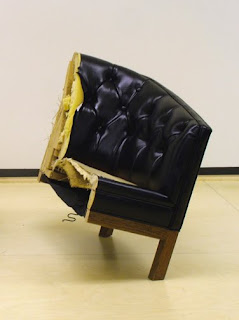
Sean M. Johnson, False Identity 2, 2010

The most interesting show I've seen in a Seattle gallery in a while is at Howard House through the end of the month (plus one). You are encouraged to go see it. And don't be fooled by the gallery's unintentionally diminishing press release, or Seattle Weekly's glowing, inane review, or even the artist's not-so-interesting comments about his own inspirations; this show actually is worth seeing.

I repeat, unintentionally diminishing. The trouble with everything I've been reading about Sean M. Johnson's This Growing Up Stuff ... is that it all focuses narrowly on the what of Johnson's objects, or worse, the why behind his making them. False Identity 1 and 2, for example, may indeed have been created in order to point to the artist's racial background, but these tilted chair halves feel more like two takes on the same subject à la Robert Indiana than they do Michael Jackson. And don't even get me started on I Was Nine. Every positive sentiment I have about this show should be understood to apply to every piece except that one.

Johnson's work is bigger than the personal narratives that serve to drive his process. It's aggressive and uncomfortable, even as it occasionally manages to be delicate. That desk attached to the wall with nothing but push pins and rubber bands is rather a prickly thing, transforming the otherwise cheerful office supplies into forcefully embedded anchors, and encouraging a cautious approach considering the obvious strain on each diminutive rubber strip. In the front gallery, the threatening confrontation of Cautionary Tale comes not from its shattered porcelain inhabiting our space, but from the lashing down that arrests the motion of the cabinet. Every element strains against its suspended state. There's something of a Rachel Whiteread "familiar made strange" [1] in these objects, and even more of Richard Serra's disorienting uneasiness. Referring to Serra's work, architect Peter Eisenman's words could just as easily be applied to Johnson: "Whether or not the pieces actually fall down, they create the anxiety of the maker and the viewer being not in control." [2] At least Johnson's in good company.

For all there is to experience in the gallery, it is quite possible to miss these effects by simply noting the factual arrangements of the objects, and being amused by the novelty. Better to look more closely. If you do, you might notice just how precariously each False Identity is perched, or catch BFFs visually teetering as it sits physically perfectly still. As Nancy Stoaks, who works in the gallery, put it, this work "resonates" beyond the literal. If you take the time to take it in, it should become apparent that in this show, the artist's grasp seems to exceed his reach.

  1. Helen Molesworth, Part Object Part Sculpture, (University Park, Pennsylvania: The Pennsylvania State University Press, 2005), 211.
  2. Richard Serra/Peter Eisenman, "Interview with Peter Eisenman," (1983), in Jon Wood, David Hulks, and Alex Potts, Modern Sculpture Reader, (Leeds: Henry Moore Institute, 2007), 347.

Friday, April 16, 2010

If You're Going to Make an Animated Movie . . .

by Stephen Cummings

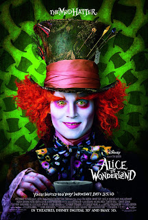
Tim Burton, Alice in Wonderland

Let's get this out of the way up front: the latest version of Alice in Wonderland is not worth seeing. I mean, maybe if you have kids under the age of ten and you want them giggling for an hour and a half over some fantastical creatures galumphing [1] about you could see it, but unfortunately for you and the rest of us, the fantastical creatures don't do anything particularly interesting.

Nor do they look particularly good doing it.

In 1993 — that's 17 years ago, twenty-somethings — Industrial Light & Magic set a new standard for the integration of live-action and digitally generated content with Steven Spielberg's instant classic Jurassic Park. It was incredible. The way those dinosaurs looked like they really were right there with the actors! And about to eat them! And while things have advanced since then, Jurassic Park holds up surprisingly well. Go back and look at it. You can distinguish animated from animatronic because the digital creatures move more naturally, but there are exceedingly few places where you might notice a problem with the lighting or texture (in other words, the thing looking like it's part of its environment). And in fact, the use of both digital and physical versions of the beasts helps to enhance their believability. It's a lesson today's filmmakers should take to heart. While some recent pictures, like Spike Jonze's Where the Wild Things Are, do combine animation with good-old-fashioned props and suits to stunning effect, too many are relying too heavily on digital imagery, and failing to meet the responsibilities that entails. Remember when Tim Burton used to build sets?

I'm exaggerating, of course, but Burton's latest picture has a serious issue. With so much of every shot being either created or modified digitally, the concern is not so much how to incorporate an animated element into live-action film, as it is how to squeeze Mia Wasikowska, Johnny Depp, and Anne Hathaway into a total unreality. Burton, like so many others, does not meet the seventeen-year-old standard of Jurassic Park, though a more fair comparison might place it with The Phantom Menace, in which it's been noted that 95% of the filmic landscape was created digitally. [2] A still unmet standard, still over a decade old. Clearly, too little effort has been made to bring the animated elements off as "real" — whatever that begins to mean in a film like this — but there are some awkward choices as well. With a head the size of the Queen's, some digital manipulation is obviously necessary, but what about her companion, the Knave? Sure he's a little taller than normal, but Burton's giant in Big Fish was made to look giant without having a fully digital body. And if you're going to animate something as simple as that, why aren't Depp and Hathaway animated too? It has to be admitted that the two look out of place, no matter how made-up they are. And why saddle yourself with the burden of trying to create a photo-real Wasikowska for all those times when Alice does something impossible? When you fail — and Burton did — all you get is a semblance of Alice standing in for the real one. Furthermore, animating the figure provides greater opportunities for stretching and distorting it, but none of the new Alice's transformations are nearly as interesting as those from Disney's 1951 hand-drawn version. If you're not going to take advantage of the freedom offered by animation, why animate? And if you must animate — for . . . budgetary reasons? — why not take advantage? And if you're going to animate just about everything anyway, why not just animate everything? Why not make an animated film?

Like its title character, this film suffers from a confusion over what it wants to be. And it's not just the animation issue. For instance, you might think that with a foundation built of Lewis Carroll's famously bizarre Alice's Adventures in Wonderland and Through the Looking Glass, with direction by none other than the man who brought us Edward Scissorhands — you might think there must be something a little off about this newest, wonderful Wonderland, something askance, uncomfortable, or disturbed. Yes! the Queen's head is much too large. And Johnny Depp's eyeballs are opaque! Surely there must be something disquieting driving this uneasy place! But there isn't. The Queen's bad, so's the Knave, everyone else is trapped, Alice please save us you're the chosen one, end of story, yawn. If you want complexity, you'll have to look elsewhere.

But that's not to say there isn't a subtext. There's confusion there too. Alice spends her time in this film learning to accept her place in the preordained structure of Underland (as it's been rechristened for 2010). She must fulfill the prophecy and slay the Jabberwock, however much she swears she won't, and in the end she does. Taking this lesson with her to the surface — that is, back out of the rabbit hole — Alice has no choice but to . . . reject her place in the social hierarchy and follow her own path. Wait. What? (Maybe it's about the difference between real responsibility in the imaginary world, and imagined responsibility in the real world?)

Disneyfication these days is worse than it used to be. The most Tim Burtony thing about this film — aside from the obligatory pairing of Depp with Helena Bonham Carter — is Danny Elfman's score, which provides a promisingly eerie introduction to a film that thereafter shies away from true oddness in favor of the non-controversial. And, as the credits begin to roll, whatever mood Elfman had managed to hold on to is totally shattered by Avril Lavigne.

Damn, Alice is empowered now.

So, fate or self-determination? Tim Burton or the Walt Disney Corporation? Make up your mind. And I maintain, if you're going to make an animated movie, do it.

  1. 'Galumphing', by the way, is one delightful word from Jabberwocky which, unless I'm mistaken, did not find its way into the film.
  2. David Norman Rodowick, The Virtual Life of Film, (Cambridge, Massachusetts: Harvard University Press, 2007), 106.