Monday, April 26, 2010

Walking and Talking and Going to a Reading About Walking and Talking

by Sean Flannigan

Flâneur, something Baudelaire defined loosely as a "gentleman stroller of city streets," or more directly and gender non-specifically, "a person who walks the city in order to experience it," is a term derived obviously from the French, those lackadaisical and aimless walkers. It is a term I had not had the pleasure of knowing until just days ago when I saw it on the "internet." It is a term that explains me in ways English simply doesn't provide for satisfactorily. Also, it bears a comfortable resemblance to my last name. This aforementioned "internet" also informed me of a reading that was going to take place at the newly located, local and independent bookstore, Elliott Bay Book Company, Saturday night at 7 pm.

Now, to divert attention from this reading for one moment, I will talk about the bookstore. This wonderful independent bookstore once lived in Pioneer Square, a little historic district in the south of downtown Seattle, in an old building with old wood floors and old wooden bookcases and old stairs made of wood. It was a comfortable place and the floor creaked a bit when you walked across it. I liked it and would often find myself there after a bout of flâneurism, sometimes buying something from the bargain section, sometimes not. Then it decided to close. It moved to the illustriously hip and gay and bar-ridden Capitol Hill, a flâneur's dream come true. To celebrate the arrival of Elliott Bay Books, Capitol Hill threw a party with a beer garden, food (from Via Tribunali pizza, Elliott Bay Cafe, and Oddfellows) and bands, all out in the closed off street in front. It was a beautiful sunny Seattle Summer-ish day and there were a lot of beautiful people strolling and eating and drinking, in celebration of books! I bought three books that day (Everyman and Exit Ghost by Philip Roth and Oracle Night by Paul Auster, both authors which you should read). The new location is better, I think, and still appropriately woody and old-seeming.

The reading took place below the bookstore in a musty basement with old books lined up along the wall behind the stage for effect. Although there were lights hanging everywhere about the old basement, it still seemed dark. Wooden chairs with blue cushions were set up in uncommitted rows and were sparsely occupied by people in groups of two or three, one chair in between like the unused urinal between men in public restrooms.

The book, Ten Walks/Two Talks, was written by two men named Andy Fitch and Jon Cotner. It was published by Ugly Duckling Presse, an independent writer-and-artist run press out of New York City. Beforehand, I overheard Jon Cotner talking to the girl who would be introducing them and telling her that she need not say that Andy is not here, stuck in Wyoming in the snow, and that rather they would "maintain the illusion" that the man accompanying Jon to the stage was Andy. The two men, after a few minutes, were introduced and came up to stand behind the dais, at which time it was explained that the man beside him was, in fact, not Andy who was stuck in snow in Wyoming, but would be reading his parts nonetheless. I do not recall this man's name. The idea of the book was born from two projects, the first being Andy's alone, in which he walked in New York, aimlessly as it were, for sixty minutes on sixty consecutive days and would subsequently write sixty lines about each. The second project was the both of theirs and it involved the recording of forty-five minute talks in stationary places about New York, of which two were chosen and distilled for this book.

The reading included a segment of a walk, then some of talk one, then another segment of another walk, then some of talk two. They traded off line for line on the walks and each had a voice in the dialogue. Throughout the reading of the first walk, I assumed that they took these walks together and each wrote thirty lines. This I found not to be true. I wished that only one person read the lines of the walk, so that I could be sure if it were the content that I thought didn't flow or if it were just the back and forth dual nature of the reading. Either way, it didn't seem like it flowed poetically or in action. I like the images (there was one in which a woman got out of a car and clenched her butt muscles). It seemed like it could be successfully transmitted if singular in voice. As for the talks, I liked one but not the other. One occurred in Central Park and one in a natural foods market they call simply WF. The Central Park conversation seemed clipped and staged, very unlike real conversation, as if they were too aware of themselves and said pseudo-philosophical things in place of the normal fart jokes of lady ogling. They talked aesthetically about their surroundings and I couldn't seem to get interested in it. The second talk was better and much more like a regular dialogue, as they talked in the table-and-chairs area of their New York WF. It seemed, though, that these talks were nothing incredibly special besides the fact that they were recorded and published in an edited form. Couldn't many of us do the same thing?

All in all, I liked it and didn't. I liked the concept very much and wished that I, myself, had come up with and executed it. Walking and talking are such intertwined activities and both can be beneficially aimless. To see this in written form may change my mind, but I feel like it was like weak tea when you really want to taste it. Like weak and slightly pretentious tea. Nonetheless, check it out. I could be wrong.
Tuesday, April 20, 2010

False Identity

by Stephen Cummings

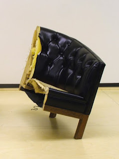
Sean M. Johnson, False Identity 2, 2010

The most interesting show I've seen in a Seattle gallery in a while is at Howard House through the end of the month (plus one). You are encouraged to go see it. And don't be fooled by the gallery's unintentionally diminishing press release, or Seattle Weekly's glowing, inane review, or even the artist's not-so-interesting comments about his own inspirations; this show actually is worth seeing.

I repeat, unintentionally diminishing. The trouble with everything I've been reading about Sean M. Johnson's This Growing Up Stuff ... is that it all focuses narrowly on the what of Johnson's objects, or worse, the why behind his making them. False Identity 1 and 2, for example, may indeed have been created in order to point to the artist's racial background, but these tilted chair halves feel more like two takes on the same subject à la Robert Indiana than they do Michael Jackson. And don't even get me started on I Was Nine. Every positive sentiment I have about this show should be understood to apply to every piece except that one.

Johnson's work is bigger than the personal narratives that serve to drive his process. It's aggressive and uncomfortable, even as it occasionally manages to be delicate. That desk attached to the wall with nothing but push pins and rubber bands is rather a prickly thing, transforming the otherwise cheerful office supplies into forcefully embedded anchors, and encouraging a cautious approach considering the obvious strain on each diminutive rubber strip. In the front gallery, the threatening confrontation of Cautionary Tale comes not from its shattered porcelain inhabiting our space, but from the lashing down that arrests the motion of the cabinet. Every element strains against its suspended state. There's something of a Rachel Whiteread "familiar made strange" [1] in these objects, and even more of Richard Serra's disorienting uneasiness. Referring to Serra's work, architect Peter Eisenman's words could just as easily be applied to Johnson: "Whether or not the pieces actually fall down, they create the anxiety of the maker and the viewer being not in control." [2] At least Johnson's in good company.

For all there is to experience in the gallery, it is quite possible to miss these effects by simply noting the factual arrangements of the objects, and being amused by the novelty. Better to look more closely. If you do, you might notice just how precariously each False Identity is perched, or catch BFFs visually teetering as it sits physically perfectly still. As Nancy Stoaks, who works in the gallery, put it, this work "resonates" beyond the literal. If you take the time to take it in, it should become apparent that in this show, the artist's grasp seems to exceed his reach.

  1. Helen Molesworth, Part Object Part Sculpture, (University Park, Pennsylvania: The Pennsylvania State University Press, 2005), 211.
  2. Richard Serra/Peter Eisenman, "Interview with Peter Eisenman," (1983), in Jon Wood, David Hulks, and Alex Potts, Modern Sculpture Reader, (Leeds: Henry Moore Institute, 2007), 347.

Friday, April 16, 2010

If You're Going to Make an Animated Movie . . .

by Stephen Cummings

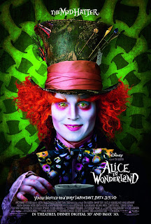
Tim Burton, Alice in Wonderland

Let's get this out of the way up front: the latest version of Alice in Wonderland is not worth seeing. I mean, maybe if you have kids under the age of ten and you want them giggling for an hour and a half over some fantastical creatures galumphing [1] about you could see it, but unfortunately for you and the rest of us, the fantastical creatures don't do anything particularly interesting.

Nor do they look particularly good doing it.

In 1993 — that's 17 years ago, twenty-somethings — Industrial Light & Magic set a new standard for the integration of live-action and digitally generated content with Steven Spielberg's instant classic Jurassic Park. It was incredible. The way those dinosaurs looked like they really were right there with the actors! And about to eat them! And while things have advanced since then, Jurassic Park holds up surprisingly well. Go back and look at it. You can distinguish animated from animatronic because the digital creatures move more naturally, but there are exceedingly few places where you might notice a problem with the lighting or texture (in other words, the thing looking like it's part of its environment). And in fact, the use of both digital and physical versions of the beasts helps to enhance their believability. It's a lesson today's filmmakers should take to heart. While some recent pictures, like Spike Jonze's Where the Wild Things Are, do combine animation with good-old-fashioned props and suits to stunning effect, too many are relying too heavily on digital imagery, and failing to meet the responsibilities that entails. Remember when Tim Burton used to build sets?

I'm exaggerating, of course, but Burton's latest picture has a serious issue. With so much of every shot being either created or modified digitally, the concern is not so much how to incorporate an animated element into live-action film, as it is how to squeeze Mia Wasikowska, Johnny Depp, and Anne Hathaway into a total unreality. Burton, like so many others, does not meet the seventeen-year-old standard of Jurassic Park, though a more fair comparison might place it with The Phantom Menace, in which it's been noted that 95% of the filmic landscape was created digitally. [2] A still unmet standard, still over a decade old. Clearly, too little effort has been made to bring the animated elements off as "real" — whatever that begins to mean in a film like this — but there are some awkward choices as well. With a head the size of the Queen's, some digital manipulation is obviously necessary, but what about her companion, the Knave? Sure he's a little taller than normal, but Burton's giant in Big Fish was made to look giant without having a fully digital body. And if you're going to animate something as simple as that, why aren't Depp and Hathaway animated too? It has to be admitted that the two look out of place, no matter how made-up they are. And why saddle yourself with the burden of trying to create a photo-real Wasikowska for all those times when Alice does something impossible? When you fail — and Burton did — all you get is a semblance of Alice standing in for the real one. Furthermore, animating the figure provides greater opportunities for stretching and distorting it, but none of the new Alice's transformations are nearly as interesting as those from Disney's 1951 hand-drawn version. If you're not going to take advantage of the freedom offered by animation, why animate? And if you must animate — for . . . budgetary reasons? — why not take advantage? And if you're going to animate just about everything anyway, why not just animate everything? Why not make an animated film?

Like its title character, this film suffers from a confusion over what it wants to be. And it's not just the animation issue. For instance, you might think that with a foundation built of Lewis Carroll's famously bizarre Alice's Adventures in Wonderland and Through the Looking Glass, with direction by none other than the man who brought us Edward Scissorhands — you might think there must be something a little off about this newest, wonderful Wonderland, something askance, uncomfortable, or disturbed. Yes! the Queen's head is much too large. And Johnny Depp's eyeballs are opaque! Surely there must be something disquieting driving this uneasy place! But there isn't. The Queen's bad, so's the Knave, everyone else is trapped, Alice please save us you're the chosen one, end of story, yawn. If you want complexity, you'll have to look elsewhere.

But that's not to say there isn't a subtext. There's confusion there too. Alice spends her time in this film learning to accept her place in the preordained structure of Underland (as it's been rechristened for 2010). She must fulfill the prophecy and slay the Jabberwock, however much she swears she won't, and in the end she does. Taking this lesson with her to the surface — that is, back out of the rabbit hole — Alice has no choice but to . . . reject her place in the social hierarchy and follow her own path. Wait. What? (Maybe it's about the difference between real responsibility in the imaginary world, and imagined responsibility in the real world?)

Disneyfication these days is worse than it used to be. The most Tim Burtony thing about this film — aside from the obligatory pairing of Depp with Helena Bonham Carter — is Danny Elfman's score, which provides a promisingly eerie introduction to a film that thereafter shies away from true oddness in favor of the non-controversial. And, as the credits begin to roll, whatever mood Elfman had managed to hold on to is totally shattered by Avril Lavigne.

Damn, Alice is empowered now.

So, fate or self-determination? Tim Burton or the Walt Disney Corporation? Make up your mind. And I maintain, if you're going to make an animated movie, do it.

  1. 'Galumphing', by the way, is one delightful word from Jabberwocky which, unless I'm mistaken, did not find its way into the film.
  2. David Norman Rodowick, The Virtual Life of Film, (Cambridge, Massachusetts: Harvard University Press, 2007), 106.