Tuesday, August 9, 2011

The Beautiful, Bizarre End

by Stephen Cummings

Ragnar Kjartansson, The End, 2008

No praise for the Carnegie Museum’s summer programming would be complete without mentioning Ragnar Kjartansson. Having gotten some attention representing Iceland in the 2009 Venice Bienniale, Kjartansson was brought to Pittsburgh this year for his first U.S. solo museum exhibition. Song collects four of the artist’s video works (as well as one limited run performance which I unfortunately didn’t catch) and sprinkles them throughout the museum to offer their often comedic and occasionally moving experiences.

The videos variously display a half-buried, unclothed guitarist (Kjartansson), a triptych of one expectorating mother (Kjartansson’s), and the captivating nonagenarian pianist Pinetop Perkins (now deceased), whose performance deserves mention for its unadorned directness if nothing else. Perkins is mesmerizing in this piece. Sitting at his piano working his way unhurriedly through a well-worn repertoire, the man may as well be tickling a dusty old stand-up in some bygone saloon or speakeasy. He’s a hold-out from an era that’s slipped away, a time capsule in himself. Kjartansson’s The Man is as much a document of Perkins as it is a piece in its own right, highlighting the tension in mechanical reproduction between what is made and what is observed.

Whatever the case, the prize of the show is The End, which featured at that little biennial mentioned above, and is here unencumbered by any painting performance. With four guitars, two amps, a bass, one drum set, one baby grand, two bottles of bourbon, and ten furry, skin caps, this performance is assembled in the only way it could be: on video, in five projections. Kjartansson and his collaborator and fellow musician Davíð Þór Jónsson play every part in the thirty minute concoction, the only members of an eight piece ensemble uncollected in a snowy Canadian wilderness and filling the gallery’s four walls. It’s brilliant. The song, a patient, folksy kind of thing, ambles along as it pleases until those points where it builds into a great cacophony, piano or drums taking control, before settling back into its regular, leisurely warp. The mood is easy, but affecting, and the odd collection of instruments makes for a wriggling, intriguing texture, here bluegrass, there classical — now an electric guitar squawk?

Kjartansson seems to thrive on upending expectations. The setting in this piece would appear to indicate a reverence for sublime nature, but then there’s all that recording equipment, as though this great outside were actually just some inside somewhere. And of course there are the performers themselves, clearly committed when it’s their time to play, but when it’s not, hey, it’s cold outside. They warm their hands, they look around. Sometimes they take whiskey breaks. On separate walls, both of the nonperforming bystanders just walk away. There is no decorum in this group, a nonchalance which bends the enthralling audible and visual components toward something equally laugh inducing.

If you haven’t seen this piece, it’s well worth the visit. And hey, it’s in the lobby, so you didn’t hear it from me, but just wander in. I guarantee Kjartansson wouldn’t mind. And if you’ve ever wondered why art should be taken so seriously, go see for yourself that it’s not always supposed to be.

Friday, July 29, 2011

Zak Prekop Makes Good Paintings

by Stephen Cummings

Zak Prekop, 2011, Untitled

Zak Prekop makes good paintings — at least as far as I can tell, given the selection currently on view at the Carnegie Museum. As part of Pittsburgh's 2011 Biennial, the museum has assembled a group of works ranging from generously sized found objects to stacks of a newsprint comic book to sculpture that urges the use of 3D glasses. The sampling makes Prekop's flat canvases appear downright traditional, even as they thwart expectations. While much else in the show seems to be clambering (yes, clambering) for attention — albeit with a fairly uniform detachment — Prekop's works stand out from the others not because they stretch farther, but rather because they hang back, waiting for you to take notice. Do.

In total there are seven paintings, roughly human in size. I say 'paintings', though all but one of these pieces include collaged paper. They represent a breed of abstraction somewhat reminiscent of the irregular, amorphous color forms of Ellsworth Kelly, as well as the great collages of Henri Matisse, which he called "drawing with scissors." Two pieces in fact are straight collage in the Matisse tradition, but with their cut paper shapes adhered to the backs of their stretched, bare canvases — and minus the color. Much as these predecessors, Prekop is drawing with the edges of his shapes. This as opposed to forming the edges of those shapes through his drawing, just one of the apparent contradictions that makes the work so engaging.

If there is any expression in these forms at all, perhaps it is to be found in the edges, but taken with the work's other elements, a cool remove is constantly established. Where there is color, it tends to be muted. Where there is pattern, it is interrupted. Where texture is evident, it is ever used to emphasize these paintings' stubborn flatness. Even when offering up a deep, Yves Klein blue, or running blue and red racing stripes across a canvas, Prekop deliberately interrupts his compositions, substituting reticence for would-be boldness. Fields of paint are broken up to make their holds on the canvases merely tentative. Much of what is presented seems as though it has already been peeled away. There is nothing of Agnes Martin's search for the sublime in the patterning here. Something so grand is necessarily undermined. We're not allowed to grab hold of anything in considering this work, as though we're repeatedly being told No, it can't be.

This is precisely these paintings' allure. Because nothing is asserted without due contradiction, a skepticism is instilled that is either melancholy or refreshing, or probably both. Without being allowed to fall wholly into any one illusion, we must enter each deliberately, aware of the impossibility of the journey, but willing to indulge nonetheless, just for the moment. What Zak Prekop has offered is a space stripped of presumption, where everything must be taken as false before anything can be accepted as true. The result is a group of works that do not ask you to come in, but, once you have, are reluctant to let you out.

Thursday, July 7, 2011

Another On Kawara

by Stephen Cummings

On Kawara, 1978, Apr. 27, 1978

My compliments to the Carnegie Museum of Art for hanging their collection chronologically. The practice is in no way unusual of course, but in this particular configuration it allowed me to experience an old artist in a new and supremely satisfying way. I've seen On Kawara's paintings before, those brazenly direct canvases putting forward nothing but a date. Oct.31,1978. Apr.24,1990. If you don't know about the Today Series, it might make you go, Huh, someone painted a date. If you do know, it sort of makes you go, Huh, he really does paint the dates. The experience definitely has a slant of novelty, but the paintings are more than that. There's a Minimal appeal to the work; clean, white letters on flat, dark grounds; and there's something vaguely profound about the act of constructing the date and offering it up for consideration, as though the day itself were being made, or would not have otherwise been. Most often you'll see these canvases alone, single examples amid the throb of post-modern (are we calling it that?) exuberance, or reticence, or reductive, deconstructive explication. At other times you might find two or three together, a little huddling group looking skeptically at the other artists' paintings. Why so showy, Ellsworth Kelly? Then there are those retrospectives, which I have not seen myself, but that pictures indicate are filled with nothing but date paintings, great, stark gatherings of day upon day, powerful in their uniformity.

At the Carnegie Museum my experience was different. Perusing the Scaife Galleries from present to past I first came upon Kawara's Feb. 29, 1988, a small, grey to black object in the classic Kawara style. My reaction was typical, something along the lines of, Ah, On Kawara. Little more thought was given. I've seen these, after all; my visit was not interrupted. Farther on however, in another gallery, I found myself considering Apr. 27, 1978. Wait, hadn't I just seen On Kawara? Confused, I backtracked to find the first painting. Indeed I had. So little notice had I given the first time that I still was unsure whether my mind was playing tricks on me when confronted with the second, red painting. Now I could compare them in my mind; I had forgotten some of these Today paintings came in color. The pleasure began to set in. Around another wall, 19 Jul. 68. This one was again grey-black (more grey and less black?), but with rounded lettering, more like the free-loving ‘60s. I laughed out loud.

Needless to say, I enjoyed the surprise. Setting aside the novelty, however, there is much to recommend this way of presenting and considering Kawara's work. It's tempting to group the Today paintings because their forms are so similar. Presenting them far apart from one another must be a far more conscious decision than with the work of someone like Philip Guston, for example, whose paintings underwent massive transformations during his career. By seeing them apart, we are reminded that each painting is in fact unique, something that's easy to forget when they are presented serially. We may also be reminded of their similarities though. It helps to see Kawara's paintings grouped with other paintings of the same period, to be reminded what Frank Stella and Paul Feeley were doing when Kawara painted 19 Jul. 68, and what Bruce Nauman was doing when Feb. 29, 1988 was made. The Today Series is remarkably consistent in the presence of such changing approaches, and all the more remarkable for having remained so over so many decades.

The greatest pleasure for me was to be reminded of the passage of time, to remember that each of these dates is distinct, and represents a real time in the past. Kawara's paintings — whether you see the accompanying newspaper-lined boxes or not — are like time capsules sent out into the world to remind us of our own existence. One day in 1968, On Kawara actually made the day, a day different from all the other days, distinct from the day before and the one after. And here it is for us too see in 2011, 19 Jul. 68, just as it was then, made by a man alive on that day, considered by you and me on this day. Without the progression, from one day in 1968 to another, separate and distinct, in 1978, to yet another, equally unique, just as far removed, in 1988, it’s too easy to see each painting as just another day, one in an endless series of sameness. Fortunately, at the Carnegie, these paintings are much more.

Tuesday, June 28, 2011

If you don't have anything interesting to say . . .

by Stephen Cummings

Nicholas Nyland, Flemish Lines, 2011

I get it. Art has diverged fairly radically over the past century and a half from what the general mass of humanity expects or recognizes or accepts or wants art to be. Obviously. It is thus no wonder museums feel the need to provide some kind of written context for much of the work they display. English, after all, is generally intelligible — certainly more broadly intelligible than art — in English speaking countries. (One exception unfortunately: artist statements.) So, in addition to titles, dates, media, title cards are also adorned with little blurbs of information, presumably to illuminate things about works of art that we might not otherwise have noticed. Sometimes it's helpful, but I would like to offer some unsolicited advice to the Seattle Art Museum: If you don't have anything interesting to say, please, don't say anything at all.

Case in point: a trio of sculptures by Nicholas Nyland, loafing away the summer at SAM's Olympic Sculpture Park.

From what I can tell (and I can't say for certain because I haven't seen the other work in person) Nyland's sculptures tend to be a bit more interesting than those in the park right now. The wacky playfulness that brought forth odd, colorful piles recalling Antoni Gaudi and Lucio Fontana, what Jen Graves called "sweet messes", seems to have given way to bland geometry. Bland because these geometric forms that demand to be considered in themselves have been mussed by hollow, arbitrary colors, as though the geometry were not enough. Bland because the haphazard geometry of the two brick pieces is not enough. And bland because what should have been three sculptures made of rope, are for some reason to be considered as one, as though each unit were not enough in itself. To consider them together removes the simple power of any one.

So Nyland didn't quite hit it this time. It happens. But! here's the Seattle Art Museum to save the day! Just a little context will make your whole viewing experience worthwhile — unless it turns out the museum basically tells you nothing. As an example, let's examine the label for Nyland's Embroidered Path, a piece made of bricks splotched with color, laid into the floor of the park's meadow.

Using bricks he painted with vibrant glazes and then fired, Nicholas Nyland created Embroidered Path, a sculpture masquerading as a garden path. Placed directly into the soil so that each brick is seamlessly integrated into the Meadow, this modest work recalls decorative walkways used in formal and backyard gardens, further revealing our attempts to shape nature. Visitors are encouraged to walk on Nyland’s Embroidered Path through the Meadow.

There are several problems in this short description, which we'll consider in turn:

  1. Do we really need a physical description of the piece directly in front of us? It's right there.
  2. The description is inaccurate. Each brick is not "seamlessly integrated into the Meadow". Some are clumsily tilted out of the ground, and I'm going to go ahead and say that even if they weren't, the meeting of brick and earth with plants growing out of it necessarily includes a "seam". What is the point of calling it seamless?
  3. "[T]his modest work recalls decorative walkways [...]." No shit.
  4. "[F]urther revealing our attempts to shape nature"? Where does this come from? Was there something else that partially revealed our attempts to shape nature?
The only thing really to be gained from the museum's helpful little tidbit is that visitors are encouraged to walk on the piece. The rest is fluff, trying to make the work bigger than it is, and making it kind of sad by being so feeble. The other labels are not much better, mentioning the nautical context of proximity to Puget Sound, but failing completely to suggest or consider what that might mean.

So what's the museum's alternative? Pointing out something about the work that isn't blatantly obvious is a good start. It might also be good to say things that don't seem to come out of nowhere. What artistic traditions does this work draw upon? (Besides the fact that it's a path. Obviously it's a path.) Is the location actually important, or are you just saying it's important? Are these site-specific works, destroyed upon removal? Alternatively, perhaps some of the artist's biographical information could be included. Who is he? Where did he come from? Is all his work like this?

The answers to these questions are not to be found at the Olympic Sculpture Park this summer. Maybe next year. Or, and I know this is crazy, the museum could say nothing, and the work could be left alone, forced to speak for itself.

Saturday, May 7, 2011

Digging Paint

by Stephen Cummings

Ryan Peter Miller, 2010, Stegosaurus

Ryan Miller's a smart ass. (That's Ryan Peter Miller, sorry. Probably a union thing.) When I first saw his work in 2007 I called him Mr. Contemporary Art — whatever that can mean. There was an attitude in the work that set him apart from his then MFA colleagues. On the walls of his open studio hung small panels that took shots at artists and movements and even painting media with the brand of ironic iconoclasm that's proven important over the past few decades. Most prominent in my memory are a Warholian sort of memento mori that turned childish things oddly serious in its poking fun at encaustic paint, and an aggressively blunt poke at — well, if not everything, at least a lot of things. It was funny, and snarky, and maybe a bit much at times, but it stayed with you. All this work was organized into a pair of Ain'ting shows in that and the following year, so you'll probably remember it if you happened to be in Phoenix/Tempe at the time, lookin' at art.

I paid a fresh visit to Miller's studio recently and was happy to see he's still dripping, molding, pushing paint together in ways related to but quite distinct from those Margie Livingston started playing around with — and getting praise for — a couple of years after. These aren't just pretty pictures — well, objects; Miller has more of an agenda, more of an awareness, and more of a sense of humor. One work in progress is half paint half mustard; another casts acrylic as paper. The attitude is out in front in works like these, but the pieces that really caught my eye were slightly more lighthearted: a series of, of all things, dinosaurs. [1]

In this group of panels, Miller is creating images — as opposed to objects with an emphasis on their own objecthood — but he's hardly painting a picture in the traditional sense. Each panel consists of layers and layers and layers of thinly applied acrylic, strata that have been carved into to reveal the visages of these prehistoric behemoths. He's digging for dinosaurs; it's funny. The quality of these super simplified pictures reminds me of postage stamps for some reason — three foot width notwithstanding — but they're maybe more reminiscent of the old game graphics that appeared as primitive lines of color on our early '90s TV screens. That, and the fact that we're looking at dinosaurs, a childhood favorite, takes us back, as the paint takes us literally back into the painting surface, into its own history. Things start to get tangled up quickly in these, maybe part of their appeal, but equally important is that the panels are just gorgeous. The surfaces glisten, milky and tactile, and there's something mysterious and stimulating about those hollowed-out troughs of color, reminiscent in their flickering juxtapositions of the divisionism of Georges Seurat or Chuck Close, an unexpected treat. The paintings were displayed in Chandler last year, so maybe you saw them then, but if you didn't (as I didn't) they're well worth seeking out.

So keep an eye out for Miller; his is a an active mind with a sharp wit. And if he's occasionally heavy-handed in his protests, at least he has the chops to make the experience one to indulge in.

  1. I'm nerd enough that I feel obliged to point out that Pteranodons are not dinosaurs, strictly speaking, but pterosaurs. Please forgive me the use of the catch all.

Saturday, April 30, 2011

Fundamental Truths

by Sean Flannigan
Jon Krakauer, 2003, Under The Banner of Heaven

Continuing on the thread of books I've recently read, I will present a book wholly different than my last, and in the realm of nonfiction. This time I read Jon Krakauer's Under the Banner of Heaven: A Story of Violent Faith. The book's central focus is on the horrific murder of Brenda Lafferty and her infant child Erica. They were killed by Dan and Ron Lafferty, Brenda's brother-in-laws, who were commanded personally to do so by God, or their God at least, the one that speaks into their brains. The Lafferty brothers are Mormons, but that is too simple. They are fundamentalist Mormons, part of one of the ubiquitous sects of the dry West, dividing like cells, spawned by multitudes of differing revelations. From this one detestable act, described throughout the book from all available sources including the brothers themselves, Krakauer shines a light on the violent past and present of this relatively new pariah of a religion.

I say pariah, but in more recent years it has gained a great deal of traction. We've even had, and will have, a possible presidential contender who is of the faith. Mormonism is growing exponentially, much thanks owing to their responsibility to mimic the reproduction of rabbits. More children, more workers, more believers. They send missionaries out across the nation, and further into all the nooks and crannies of the world, suited-up in black and white and kindly asking for everyone's hand in theological union. This, though, wasn't the case at Mormonism's conception, inside an old hat with the face of Joseph Smith, who spoke with confidence of the existence of buried golden plates left by an angel called Moroni. The wild revelations of Joseph Smith needed time to lay down roots in the minds of the people.

It is that beginning, the creation of The Book of Mormon, and the ensuing struggle for legitimacy that Krakauer explores in an effort to explain the phenomenon of Mormonism's fundamentalist progeny. It seemed to me a very level analysis and history of a very guarded and temperamental faith, both the main Latter-Day Saints church and their unintentional polygamist offspring. Krakauer did a great deal of research in order to confidently write about an ever-present but not widely understood religion, using the Mormons' own well-recorded histories and religious texts as well as highly regarded books and personal interviews. The picture that emerges, from Joseph Smith's small band of followers to the more recent polygamist sects, is that of a extremely well-run and tremendously paranoid cult whose power structure at times resembles that of the mafia.

Personally, I couldn't put the book down. It was engrossing, suspenseful and disturbing; a story so strange it had to be real. Like all great sociological or anthropological studies, Under the Banner of Heaven illustrates the malleability of human consciousness under the sway of an ideological construct. A convincing origin story, or at least one which stirs the audience's heart, can evolve (or mutate) into something grander (or more monstrous), given the right circumstances. This is the case with Mormonism, born on the back of a crooked con artist (historically verified) and sold with the gusto of the best Evangelical pastor.

And this is not to single out this one particular religion. The most populous religions, the ones which rule the world's theological pie-charts, all have histories of great crookedness and horrid violence. None should be off the hook. The only difference is those who own much of the pie are the ones whose histories are just large enough to build a religion yet too sparse and ancient to build a case against. The truth is that no-one can scientifically say that any virgin births occurred, ever, or that the supposed product of said unverified event was reborn three days after he died in the company of criminals. The story put forth by Joseph Smith was crazy because it was crazy, but also because it was unfamiliar. Who is to say what is familiar isn't also improbable and crazy as well?

Love it or hate it, Under the Banner of Heaven is an undeniably interesting read and you will know more for having read it. So, go read it.

Sunday, March 27, 2011

Recently Read

by Sean Flannigan

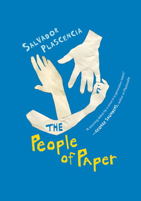
The People of Paper (McSweeney's Books, 2005)

A friend lent me this book by Salvador Plascencia, thought I'd like it, as he returned to me my copy of Kundera's Unbearable Lightness of Being. The book was overlarge where width and height were concerned, but a cursory glance through the relatively thin volume showed its post-modern flare, with ever-changing blocks of formatting, black shapes covering up some or all of certain narratives and small illustrations breaking up (and supposedly holding up) the story. These things excited me and I began reading it the next day.

The book centers around Federico de la Fe, father and husband, who must change the straw in their mattress each Tuesday by the river for all the uncontrolled piss he makes at night. His wife, Merced (who loves limes), chooses not to be pissed on anymore and leaves them both. The story springs from this sad point, the narrator changing with each column of text, from Little Merced (the daughter) to Rita Hayworth to Baby Nostradamus and more. Federico tempers his sadness by burning himself, which he hides from Little Merced (who also loves limes). This works for him and he always wears long sleeves. The main narrator is Saturn, that third-person omniscient whom Federico blames for everything, and whom Federico wages a war against with the carnation-chewing gang of the town of El Monte in Southern California. Saturn sees everything, hears everything, is making a history of their lives with his voyeurism.

Oh, yes, there are also the people of paper. A highly skilled origami artist began by reanimating his dead cat with paper organs and paper arteries before working his way up to human organs, and finally whole people of paper (whose fellators develop paper cuts on their tongues or wake up with soggy newspaper skin stuck to them overnight).

Needless to say, there are a great deal of creative elements at work in this book, so much so that to be brief about it is to sound a little ridiculous. His language is something like I have never read, totally casual yet thick with imagination, self-aware but not grievously meta. He brings the reader into a world occupied by obvious creation, occupied by the writer himself. It is a book mired in the sadness of loss and the futility of displaced anger. The characters and their struggles are tied to all who involve themselves in the story and illustrate how personal the act of writing fiction is.

Overall, I would recommend picking it up and giving it a try. It is something different, a little fantastical and very smart.

I will conclude with a small passage from the beginning that I just turned to:

Saturn

Saturn was aligned directly over Federico de la Fe, following him wherever he went, budging a half a space centimeter for every five hundred land miles de la Fe and Little Merced traveled. But once Federico de la Fe retreated into the lead shell, safely hiding from view and refusing to reemerge until the weight from the air was lifted, Saturn withdrew into his orbit and faded into the blur of the chalky galaxy.