Sunday, February 21, 2010

Hey MCA, Why so serious?

by Stephen Cummings

Rodney Graham

Currently at the Museum of Contemporary Art, Chicago is a show called The Artist's Studio (or something like that). It's a collection of, um, contemporary work that deals with — surprise! — artists' studios. So, points for straightforwardness. A decently interesting sampling, the media ranges from painting to a galleryfull of laser-etched glass. Also prominent are a performance (now the remnants of a performance) by Indian artist Nikhil Chopra, and a room of videos by William Kentridge. It's definitely the best work I've seen by Kentridge; a little lighter, not quite so Oh, this is so profound. Not quite. That self conscious gravity is by no means absent. Chopra's performance, likewise, while potentially funny, was pretty heavy, and created a rather imposing space. And given the way he talks about the work, I doubt if he means to wink in our direction.

Actually the whole show is pretty serious. But unnecessarily. The driving force behind the insistently sober intellectualizing of every element seems to be more the museum than the work on display. To illustrate this point, I'll take as examples the two artists who bookend the exhibition.

At one end — the end end — there plays a video piece by Justin Cooper. It's not the only work in the room, nor the biggest, but its ferocity ensures that it is absolutely the focal point, overpowering the artist's large-scale drawings. Produced at Skowhegan, Cooper's video begins outdoors, a hand-held shot that soon moves into the studio where what can most closely be described as a tantrum ensues. The camera, or the cameraman, perhaps the viewer, proceeds, after examining and struggling with the place a bit, to tear apart the space with all the savagery of a Scottish terrier, furiously flailing about the room in an effort to displace the contents of seemingly every surface, small-animal grunts and snorts included. The point comes across pretty quickly, and it's silly. (Yep, sometimes people come into your studio, and yep, sometimes they rip you a new one.) This kind of poor-me artwork is the height of self absorption. Nobody cares. It's possible this piece is meant to be ironic, but the heavy-handedness of the snarling destruction produces a bizarre earnestness. And the museum presents it straight-faced, as if this is a profound statement about studio experience, as opposed to simplistic whining. A similar video might feature a group of painters talking about how they can't keep the pigments off their clothes. Nauseating.

Better work is to be found at the entrance to the show. There, a couple of photographs by Canadian artist Rodney Graham strike an undeniably humorous note — a note the museum utterly fails to acknowledge. Let's first consider Artist's Model Posing for "The Old Bugler, Among The Fallen, Battle of Beaune-la-Roland, 1870" in the Studio of An Unknown Military Painter, Paris 1885. Now one might suppose that with a title like that the jig would be pretty much up. But loathe to admit the absurdity of such a thing, MCA's analysis has Graham "propos[ing] the artist's studio as a site where history is perpetually restaged and reconsidered." Then there's Artist in His Studio (which appears above in the context of book cover). Says MCA: "Artist in His Studio alludes to Graham's other role as a musician, with a subtly offensive hand gesture perhaps betraying a conflicted sense of the kind of studio artist he would prefer to be."

Or it's a joke. "Subtly offensive hand gesture"? Where I'm from we call it the finger. Graham's work — as well as that of some others in the show — is funny, and for MCA to just ignore that fact, seems to me to be missing out on a large part of what's there. Plus, it perpetuates the problem of alienating a lay audience by insisting that there's something they're not seeing. Sometimes work is just funny. Why don't we embrace it already?

Wednesday, February 3, 2010

A New Face in Los Angeles

by Forrest Jones

Classical music is a tough sell these days. To meet someone who regularly buys and listens to classical music is a rare event, and it is even stranger if that person is under 50. In today’s world of instant information and entertainment on demand, people just don’t have the patience to sit and listen to a beautiful 45-minute piece of music. If we all just set aside a few hours to really listen to some classical music, it might bring a little peace and focus into our overloaded, fast-paced lives.

Right now, classical music needs someone to bring the younger generation back, and that person could be the Los Angeles Philharmonic’s new conductor, Gustavo Dudamel. Dudamel is a young (29 years old), energetic, charismatic conductor from Venezuela. In his concerts conducting the Simon Bolivar Youth Orchestra in his home country, he has led the orchestra in exciting performances of varied literature, from Mozart to Mahler to West Side Story. Any good orchestra can play music well, but he knows how to make an orchestra sound exciting and fresh. Hopefully, this new sense of creativity and energy will lure in some new fans who didn’t consider classical music before.

Dudamel is a product of the excellent music education system that is in place in Venezuela, which provides music classes to poor children throughout the country. This system has been so effective, that Dudamel might merely be the first spark in an explosion of Venezuelan talent that could potentially land on the international classical music scene.

Since a conductor is also an ambassador to the public, this background could play an important role in his philosophy. As a music educator myself, I hope that Dudamel spreads a renewed sense of the importance of music in public schools. The popularity of standardized testing combined with the budget problems of many school districts has led to reductions and elimination of music programs, and the hardest hit places are the low socio-economic areas. With his experience in the Venezuelan system, hopefully he can be a catalyst for a renaissance in music education.

Of course, he also has to be a good conductor. If he can’t lead a major orchestra, then it doesn’t matter what he says. To find out, I listened to his recording of Gustav Mahler’s First Symphony with the L.A. Phil (Deutsche Grammaphon). The first great thing about this recording is that it is taken from several live concerts spliced together. It is edited, for sure, but it is still a more accurate representation of an orchestra’s prowess than a studio session, in my opinion. In listening to this recording, you get a sense of this live feeling with applause at the end and coughing in between movements. It adds to the feeling a little bit, and reminds you that this is a living, breathing orchestra that you are listening to.

As for the music, the orchestra not only plays beautifully, but with some style. Some sections are a little slower than I expected, but I really like the casual pace. It allows you to soak in the melodies a little more, and I found myself listening to them more closely than before because you really can hear every note.

This symphony is so dense and thick, that it is difficult for orchestras to play with great balance. Under Dudamel’s leadership, however, every background detail is very clear without overpowering the melody. It isn’t just a muddy wall of sound, like many recordings before this one. This means that I have heard things in this work that I never really noticed before, and I am quite familiar with the First Symphony.

What really stands out to me, though, is how the conductor does a wonderful job of portraying the elements of Mahler’s young, somewhat sarcastic personality in this work. For example, the second movement almost sounds like an 1890s dance party, and as a result, Dudamel has some fun with it. It starts with a simple but heavy bass line, moving at an absurdly slow tempo. When the rest of the “band” comes in, they try to get things back up to speed, but the basses, of course, slow it back down every chance they get. The horns, then, want to take it ever faster, so the entire movement seems like a battle between sections. At one point, the movement seemingly ends with a big bang, but the horns start to play again, as if to say “We aren’t done yet!” You can almost imagine a drunk and incompetent chamber orchestra playing for a crowded tavern, in which they can barely keep the music going. It is a fun movement.

The third movement, though, is a strange play on the song “Frere Jacques”. The melody is familiar, but it is actually in a minor key, and quite slow. The first instrument playing the tune is a rare solo string bass. This gives it the feeling of a funeral march, but why such a familiar tune? It is weird, but still intriguing.

The finale is a bombastic one with lots of fast notes in the violins and flutes, and brass and percussion playing loudly. It is exciting music, and the orchestra doesn’t disappoint. The beauty, drama, and humor of Gustav Mahler’s work is outstanding, and Gustavo Dudamel really takes advantage of it. This is a very good beginning for this young conductor. Remember the name and keep an eye out for him. Hopefully he can put classical music back on the map.

Friday, January 29, 2010

Michelangelo Comes Down at SAM

by Stephen Cummings

Michelangelo at SAM Michelangelo, 1510, Study for Adam

Before it closes, I feel it incumbent to shore up my earlier poke at what Regina Hackett has called Seattle Art Museum's "Michelangelo debacle". To be concise, this show sucked. Why, is a longer tale.

Let's start at the beginning (of the gallery, that is; the ad campaign is another matter). Walking in, past the sculpture that opens the obviously more important, though curiously less advertised exhibition on the left, one is greeted at what would be the logical beginning of the show, if it had been laid out by a reasonable person, with a sign that reads "EXIT ONLY", and points visitors toward the entrance at the opposite end of a corridor lined with Calder. Presumably this was a conscious effort to funnel people into the Alexander Calder exhibition next door, but it makes for an awkward filtering. If we're honest with ourselves, it must be admitted that a good number of the people who are likely to visit a Michelangelo show will have absolutely no interest in modern, kinetic sculpture, so really this is just putting them out. Plus, if the exit and entrance had been reversed, people would have had to filter through Calder afterward anyway. So why the forced collision? The other result of this odd choice of layout is that when people do find themselves at the entrance to the galleries, they are met with signs of equal weight sporting the headings "MICHELANGELO WEDNESDAYS", "Emergency Exit Only", and "FIRE DEPT. VALVE". . . . Unfortunately it sets the right tone.

What follows inside the galleries is not so much an exhibition of Michelangelo drawings as it is an exercise in how to simultaneously over- and under-do a thing. Yes, there are drawings by Michelangelo on display. Eleven by my count — one of which is a grocery list — though the museum claims twelve. (Are they counting the letter to his nephew?) Also on display, however, is a lot of mediocre work by artists contemporary with, or merely looking back at Michelangelo. I am nonplussed. And then there are those awful things which the museum seems to be calling 'photomurals'. Photomurals? What they are are huge, gaudy pieces of vinyl stuck on the walls and used to distract from the exhibition's lack of content. Are we supposed to feel privileged to be looking at under-life-size reproductions of famous work shinily giving a hint of the wall texture to which they cling? Each drawing is also presented with a miniature photomural next to its wall label, showing where in the larger work this particular study fits. In other words, everything in this show is presented as important only insofar as it relates to something else which is important and not present. There are a few nice drawings on display — the best of which is the Study for Adam reproduced on the catalog cover — which could have and should have stood on their own, but when a My Favorite Things tour of a Renaissance exhibition by a PhD art history student includes a couple of giant stickers, one wonders if there isn't just a little bit of fluff.

Not to be left out, the writing is also crap. Did you know Michelangelo was "multi-talented"? Perhaps the most informative example is also the most absurd, and I'll share it with you in full. It's from the label of a little model by a "19th-century artisan", and reads like a children's book:

This model, showing how Michelangelo's David was transported to the Academia in the nineteenth century, prompts questions about Michelangelo's own use of technology: How did he move the original from his workshop near the cathedral to the front of the Palazzo Vecchio? (On a special sled placed over rolling logs.) How did he bring heavy marble out of the quarries? (By tying long ropes around the blocks and sliding them slowly down the mountain.) Did the ropes ever break? (Yes, killing and maiming workers.) How did he get the material up the Arno River from Pisa? (In barges loaded using wooden cranes.) How did the material finally arrive in Florence? (On ox carts.)
Never mind that no marble by Michelangelo is actually on display here, nor even a study for a sculpture. Can't you just see the Way Things Work illustration?

Michelangelo was a great draftsman, and Seattle Art Museum promoted this show like they would showcase it, like it would be a revelation. "Michelangelo burned most of his drawings. See twelve that survived the fire." Unfortunately, flame retardance seems to have had little to do with quality in this case. And the rarity created by such a practice means it's hard for a museum like SAM to get its hands on the best work. Thomas Hoving, in 1993, declared the blockbuster show dead, saying it had simply become too expensive to gather up the kind of great work in quantities that made such events possible. The only way around this, I guess, would be to have a show so good that it would earn enough money to pay for those costs. That'd be excellent. Get people in the museum; get them telling their friends how great it is; get them looking at other artists; raise interest in art in general. But SAM didn't do that. Maybe the blockbuster is dead, and they know it. And until we know it, it seems a museum like SAM will be perfectly willing to lie to us to get us through the door.

Thursday, January 28, 2010

Art and Lit in the Bronx

by Sean Flannigan

I have the distinguished honor of needling in on the "Fine Art" portion of this blog this time. The other day I went to the Frye Art Museum, located in the flamboyant and hipster-laden Capitol Hill portion of Seattle. This museum is always great, and always free. Upon entering, you encounter a movie playing before you can even hope to see any art. This was planned. I had the distinct urge to move on. That urge was stupid and I accomplished a very parental chastisement of this urge later on in the day. I watched the whole thing. It was longish and I was standing the entire time, but it was good. I nearly cried on two occasions, but as I looked around at some of the art people, they seemed stoic and rigid and their faces didn't even attempt at tears, so I sucked it into a ball in my stomach to wait patiently for my inevitable nervous breakdown years from now.

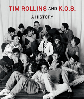
The show was called "Tim Rollins and K.O.S.: A History." Tim Rollins started what he called the "Art and Knowledge Workshop" in South Bronx, a place known for its poverty and violence, for at-risk kids who called themselves "Kids of Survival" or K.O.S. The idea was to read important literature (see where I come in here) and make art from its seeded themes. The film concerned a specific group of these at-risk kids, who would cycle through as they moved on to (hopefully) bigger and better things. With each book, they would take every page and paste them in order on the canvas. That was almost always the foundation. Tim was rough with the kids in a way that worked. He held them responsible for their own education, an education the he helped them achieve. I won't give away what happens or why I could have cried. If you can, go see it yourself (as this blog demands).

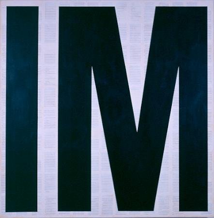
So, swallowing the intensity of the movie and shaking my legs out, I finally entered the art portion of the museum. This is where I realized how important it was that I saw that film. All these pieces which were given such thick histories involving the kids and their struggles were on display. Seeing all of it firsthand was amazing. Considering everything — the education, the synthesis between art and literature, the buoyancy it gave to their futures — I was moved. These pieces had a wonderful fourth dimension, meaning they weren't merely stretchers, canvas, print and paint, but also carried the weight of emotion and history, moved across time. These kids are now adults with something to show for their struggle.

Their pieces are part of many public collections including the Museum of Modern Art in New York, the Hirshhorn Museum and Sculpture Garden in Washington, D.C., the Museum of Fine Arts in Boston, and the Tate Gallery in London amongst others. They have also had many exhibitions all over the world and now including the Frye in Seattle. See it. It is worth it.

A Midsummer Night’s Dream XVII (after William Shakespeare), 2001
watercolor, fruit juice, aquaba paper, collage, mustard seed, xerography, rag paper on canvas
106.7 x 122 cm

The Scarlet Letter – The Prison Door (after Nathaniel Hawthorne), 1992-93
Acrylic and book pages on linen
54 1/8 x 77 3/16 x 1 3/4 "  

Invisible Man (after Ralph Ellison), 2008
Matte acrylic and book pages on canvas
72 x 72 inches

The book, published by MIT Press

Saturday, January 16, 2010

Oh, Avatar

by Stephen Cummings

James Cameron, Avatar, 2009

All right I saw it. The movie everyone's talking about, it's a wonder, gonna revolutionize the industry, yadda yadda yadda. Ok, so I saw it. And? I have to admit it wasn't so bad. You can't beat the action: giant, flying creatures meet giant, flying machines is not a recipe for dullness. Nor is slender, blue-skinned "alien" based on incredibly gorgeous actress a burden to the eyes. And the animation's pretty decent; at certain points even uncannily naturalistic. (Absolutely not always, but at certain points.) Only sometimes is the often cheesy dialogue way oversold. ("The legendary floating mountains of Pandora. Heard of them?") There's even a super-sized version of the Krupp Earth Mover. Sure the message is simplistic — ignorant, hard-hearted, capitalist, militarists = Bad; harmonious, nature-worshiping, noble savages = Good — but the spectacle, the adventure, the 3D! all come together to make it well worth the extra 25% ticket price, right?

The short answer is No. And let's ignore the fact that the 3D makes the picture unsure as to whether it's a window onto a world, or a mold through which the on-screen (in-screen?) elements should be extruded into the viewing space. We'll also let go the unabashed self-aggrandizement of the whole thing. (Even the score at the trailing end of the credits — when the disclaimers come up — crescendos to strains of I am an important movie.) No, the real trouble with Avatar is that I've seen this movie before.

Let's face it, it's been done. And done, and done, and done. This movie is Pocahotas. It's Dances with Wolves. It's The Last Samurai (really a lot). It's School of Rock; it's A Bug's Life; apparently it's Dune. Hell, it's even Galaxy Quest. I have seen this movie so many times, and while there's nothing inherently wrong with a cookie-cutter plot — the preceding films have all made this one work — James Cameron at no point gives any indication that this story will so much as prod the mold in any way. And it doesn't.

Avatar is so packed with clichés it's hard to keep them straight. Gruff marine commander, greedy corporate big-shot, hired-gun doesn't-know-what-he's-getting-himself-into newcomer, wide-eyed science geek, exasperated yet good-hearted researcher, slightly oblivious and xenophobic chieftain, much more understanding wife of said chieftain, beautiful warrior-daughter of chieftain, jealous would-be husband of beautiful warrior-daughter. Need I go on? In fact, there is very little in this film that hasn't been seen. The landscape, the sets, the fauna: not notably dissimilar from any old piece of sci-fi/fantasy illustration. (Roger Dean is getting a lot of attention online, but I'm thinking of everything from Halo to Magic: The Gathering to The Dragonriders of Pern.) Those dual-rotor helicopters: brief appearances in The Incredibles. The machine-man walking suit things: Aliens and The Matrix (the third one). Even the visual passage from human to avatar consciousness: straight out of Sliders. And and! — and I was warned about this beforehand — the subtitles: Papyrus. Papyrus?! The typeface notable for it's constant appearance on bad travel posters and holistic healing products?! As a designer friend noted: guess there wasn't money in that 500 million dollar budget for, you know, a font.

But maybe there's something to be said for bringing all this stuff together and putting it on the big screen for everyone to marvel and applaud. Especially since it comes to us in . . . Expensive 3D!. And hey, James Horner even gets on board, reprising his music from The Wrath of Khan. So, you know, maybe I'm just a curmudgeon.

Monday, January 11, 2010

Rembrandt in Reno

by Stephen Cummings

Hey Renoites. If you have any free time during the next six days, do yourself a favor and use it to go see Rembrandt.

Too often when a small museum boasts a big name, it's little more than a ploy to get people through the door. You might glimpse a meager few works by the artist you came to see, and be stuck with a glut of additional hangers on, or else the examples on display may be just . . . less than noteworthy. Not so with this show. As you may or may not know, Rembrandt van Rijn is widely considered to be one of the greatest printmakers of all time, and since November, the Nevada Museum of Art has featured a very healthy collection of etchings, drypoints, and engravings by the Dutch master, drawn from the collection at the Museum of Fine Arts, Boston. (I didn't count myself, but they say there are 130!)

In other words, this is good stuff, and I'm convinced there's something in this show for everyone. (The only failing really is that "loosely" recreated studio setup — what the hell? — fortunately you can just ignore it.) Obviously, if you are at all interested in printmaking, you can't miss such a feast, and even if you have no particular interest in the medium, a simple respect for art will ensure your appreciation. For Renaissance type tastes there are portraits and tableaux to spare, including a great many Biblical scenes to sate the devout. If your inclinations are more formal, you might find interest in the landscapes, where, freed from the demands of an established narrative, the artist was able to more fully investigate abstract arrangements. (Although he wasn't exactly shy about moving things around in the other work.) And if you don't get art at all, this could be a fine introduction. Many prints are shown in two or more states, so it's possible to see how the process moved, how decisions were made to alter psychology, or narrative, or composition. The work ranges in complexity from loose and gestural to ornately composed, and in imagery from beggars to windmills to barely intelligible darkness. Whatever your visual proclivities, I should hope you'll find something gratifying in this show.

As is usual, there's nothing like seeing this work in person. I'm sitting here right now with four catalogs of Rembrandt's etchings laid out in front of me, and none of them hold a candle to what I was looking at a couple of weeks ago. What you have down there is a treat, so take advantage before it's too late.

Wednesday, January 6, 2010

Three Literary Standouts of this Last and Dreary Decade

by Sean Flannigan

I have no "Top Ten" for this decade, or for that matter, any decade. I usually take little note of when something was written, for the most part. New writers are easier to place in a time-line, though. It's happening now. You can't miss it. I can't say what is best of this decade because I haven't read all the books of this decade, or even just the notable ones. There are a lot. But, I have read some and a few were really amazing. So, of the books of this decade that I have read, I think that three really stand out.

In no particular order:

Middlesex by Jeffrey Eugenides

This beautifully and intricately written novel blew me away. There are few books, beyond even the last ten years, that operate on so many levels as this one. The character, being what Wikipedia tells me is called "intersexed", is already a strange and mysterious persona, the idea alone holding for the great majority of humanity a perspective none could entirely fathom. But, its masterfully woven threads of his/her embattled and sometimes incestuous Greek ancestry and his/her sexually-identified and narratorly present, and his description of the 5-alpha-reductase deficiency that Calliope suffers from, captures the reader fully and makes them feel if not always good at least a little weird, sad and obsessed (especially if that reader is me). It was also the recipient of the Pulitzer Prize in 2003. This is a novel of much heft, emotionally and physically. It is a great achievement and thus has made its mark within my three notables of this last decade.

The Amazing Adventures of Kavalier and Clay by Michael Chabon

Despite what many may assume, you do not have to be into comics to be into this book. It involves all of those many segments of human emotion, from the entirely squishy to the absolutely jagged. Sometimes I get pissed. On occasion I will cry. That sort of stuff. Plus the in between. This novel was also a winner of the Pulitzer Prize, in 2001. As with most Chabon novels, the story centers around a very Jewish protagonist, or rather two. Cousins, Kavalier (a recent refugee of Prague) and Klayman (as he is named before he renames himself something decidedly more catchy) come together in New York City. They find they both enjoy drawing and both adore that famous Jewish escapist, Harry Houdini. What follows is success and disappointment, pain and joy, confusion and clarity (and probably many other opposing themes). What stuck out, what really glued me to this book, was the characters. They were strongly developed, lived next to my bedside, in my wandering work-time thoughts, and past the point of reading them. I didn't want this book to end and I felt that those characters would survive beyond the last dot delivered by Mr. Chabon. I think that they have.

Everything is Illuminated by Jonathan Safran Foer

This was my latest read. Although it didn't win the Pulitzer prize, it did feature a Jewish protagonist. It also garnered much praise from many major publications and even some very well-known authors (Updike and Rushdie, to name two). The strands of this story are each as strong as the other. In one, the Ukrainian translator, Alex, relates his story of adventure in helping a Jewish-American traveler, who he refers to as the "hero," find and assemble pieces of his family's past, which he plans to write a novel about. Another strand is the novel-in-progress of this "hero" (whose name happens to be the same as the author's) in which he details this past, going back to his great-great-great-great-great grandmother, glamorized in many shades of the most beautiful magical realism. The third narrative is the letters from Alex to Jonathan, post-adventure, where he shares his critiques of Jonathan's novel-in-progress and the events going on in his own life, back in Ukraine. Having such varied perspectives, this novel shines with a nearly unrivaled imagination. It was as intriguing and funny as it was melancholy and sentimental. This author has a strength of prose and breadth of emotion that isn't found readily and should be, when found, held close and never let go. Everyone should read this.

So, there you are. These are the good books that I have liked this last and dreary decade. The best thing to do when a tyrant rules your country for most of a decade: read good books. And on a side note, these covers were the particular covers of the versions that I read. They hold a certain nostalgic significance. I can almost feel their weight and smell their pages. It feels good. Kindle will never take over. Nothing can beat having a physical book in your hand, and the wear that they endure is proof of their significance. OK, enjoy.